For a seasonal job, Léa takes up her post as a checkout worker in a large supermarket chain. In an empty, sanitised setting, the violence of the work merges with the violence of today’s world.
An email interview with Pascale Marin, member of the Union and cinematographer on Sarah Arnold’s film.
How did the choice of S16 come about?
The film is Sarah Arnold’s fourth short; her first two were shot on film, the third digitally, and she wanted to go back to film for this one. I completely agreed. We wanted to push against a very stripped-back, almost clinical set by shooting on a very organic medium. It was a way of siding with the checkout workers, of standing on the side of life — the grain of Super 16 bringing out the diversity of their faces and their skin tones.
On a practical level, the extra cost of shooting on film was covered by the Swiss co-production, so we worked with Cinegrell Zurich, which is both an equipment rental house and a lab. That turned out to be quite convenient when it came to camera tests.
I chose 7219 stock at 400 ISO, with no special processing on the negative.
The film’s set is stylised just enough, almost diagrammatic. What were your notes or recommendations on designing the set furniture?
L’Effort Commercial was a commissioned piece in response to a “Working Women” film call. Aline Crétinoir, who wrote the original script, was 18 when she wrote this very realistic story, based on her own experience. When Sarah was chosen to direct the film, she did everything she could to move away from that realism. In particular, she decided to remove the customers and the products, and to transpose the supermarket into a studio, so as to keep only the essence of what she wanted to film: exploited women.
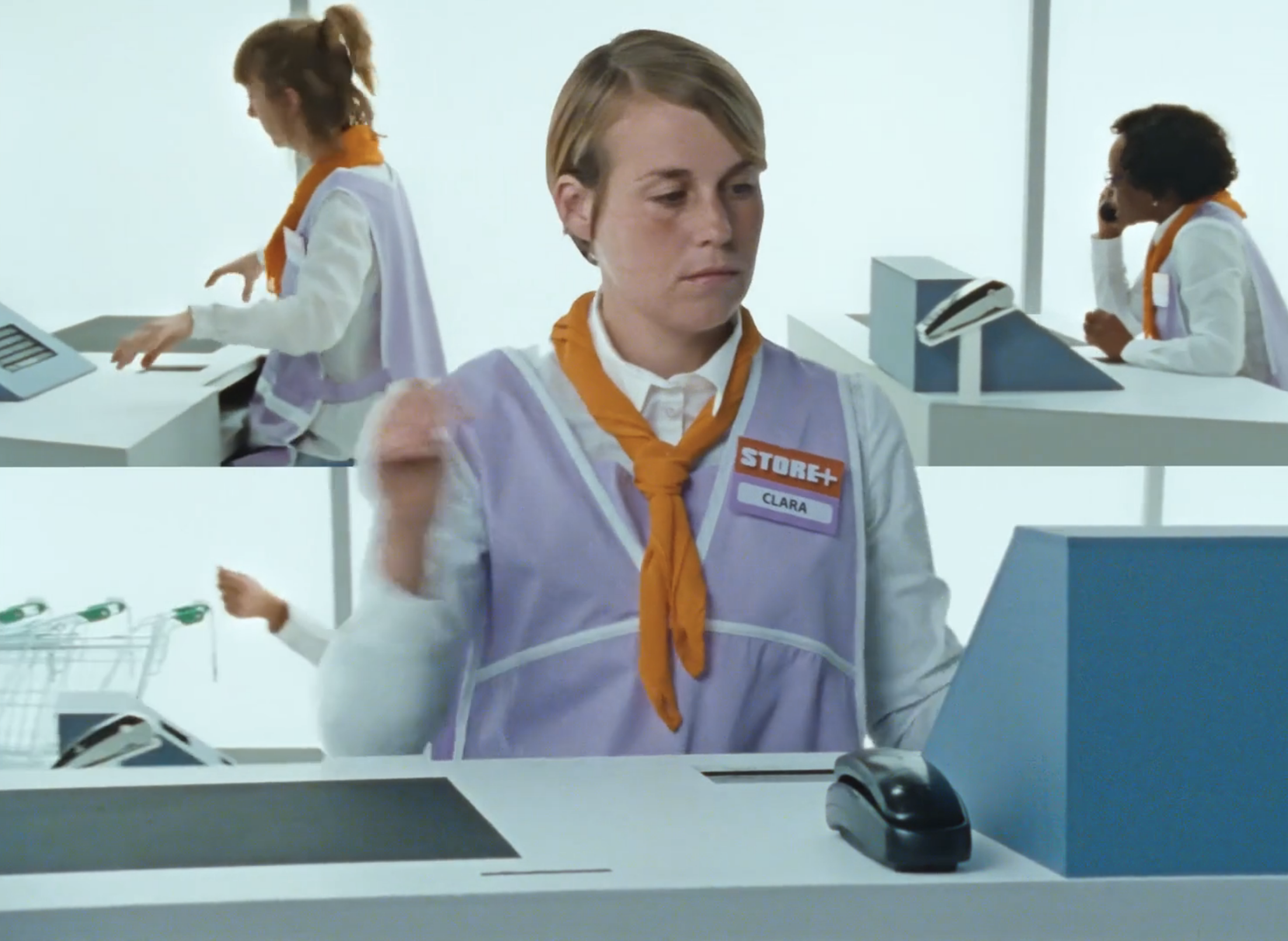
Sarah designed the look of the checkouts with Eva Medin, who is credited as production designer but is first and foremost a visual artist. Ideally we would have depicted a hypermarket with around twenty checkouts; in reality we could only afford to build five. So I suggested cheating the position of Léa, our main character, depending on the angle, so that it always felt as though there were other checkouts in front of and behind her. We also placed the checkouts precisely so that the perspective within the frame would be as interesting as possible. Sarah’s choices, together with costume designer Valentine Solé, were very carefully considered: the mauve of the smocks had to be an “infantilising”, “feminine” colour, the orange of their scarves a touch of “cheerfulness for the customer”. So Sarah and I chose the set colours for the supermarket in harmony with the costume colours. The graphic identity of Store +, the fictional supermarket we invented, had to be consistent.
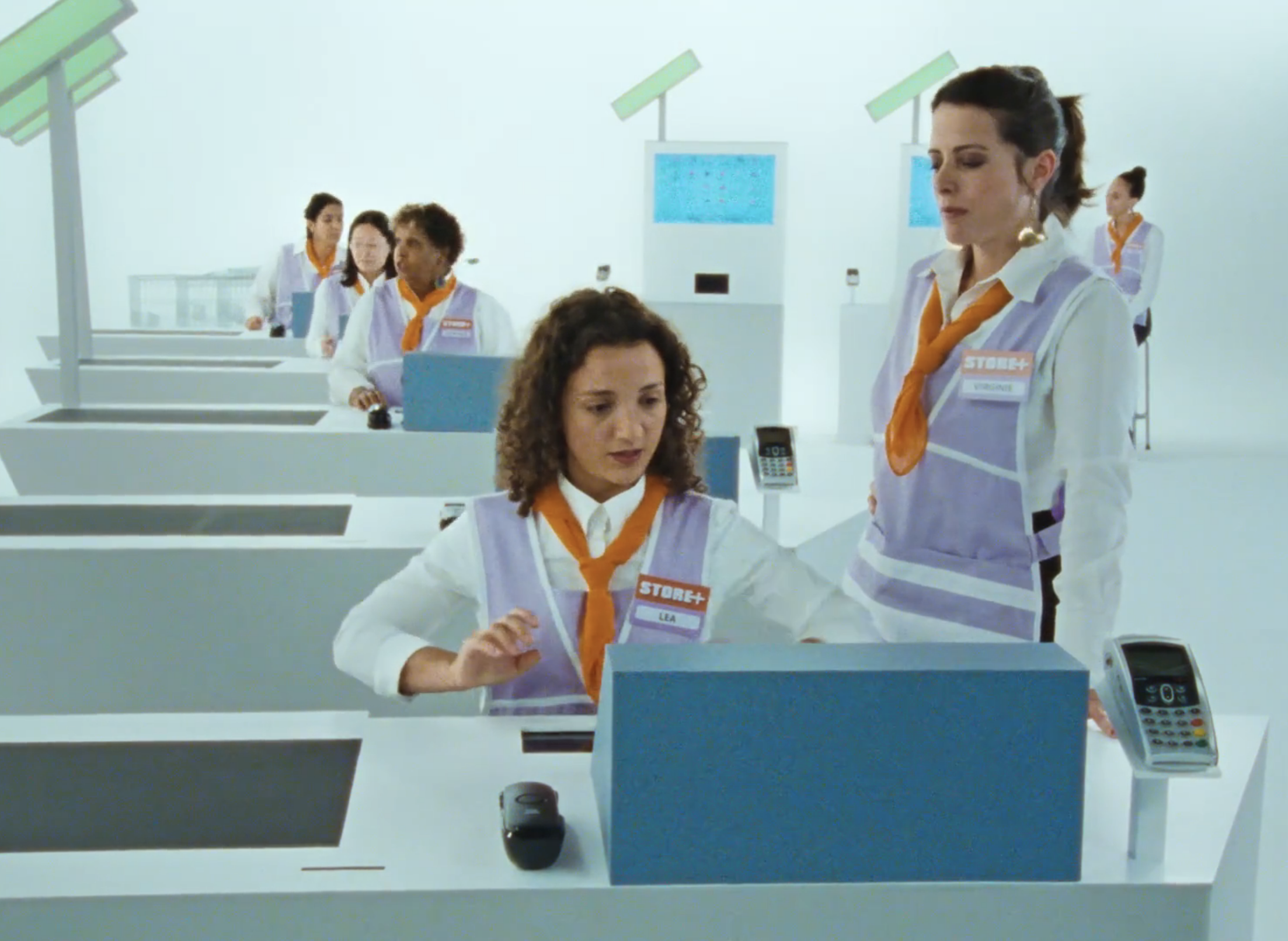
At what point does this big white backdrop become an advantage? And at what point can it become a drawback?
The white backdrop is an advantage because it helps with stylisation. It’s a drawback because it isn’t always easy to manage contrast, especially since our set wasn’t that big — we were often relatively close to the cyclorama. The choice of the 1:1.37 ratio was made before we had the set; we liked the sense of distance it created when we did portraits of the checkout workers without going all the way to close-up. It turned out to be an asset, since it let us avoid “stepping outside the limits” of our sometimes cramped set.
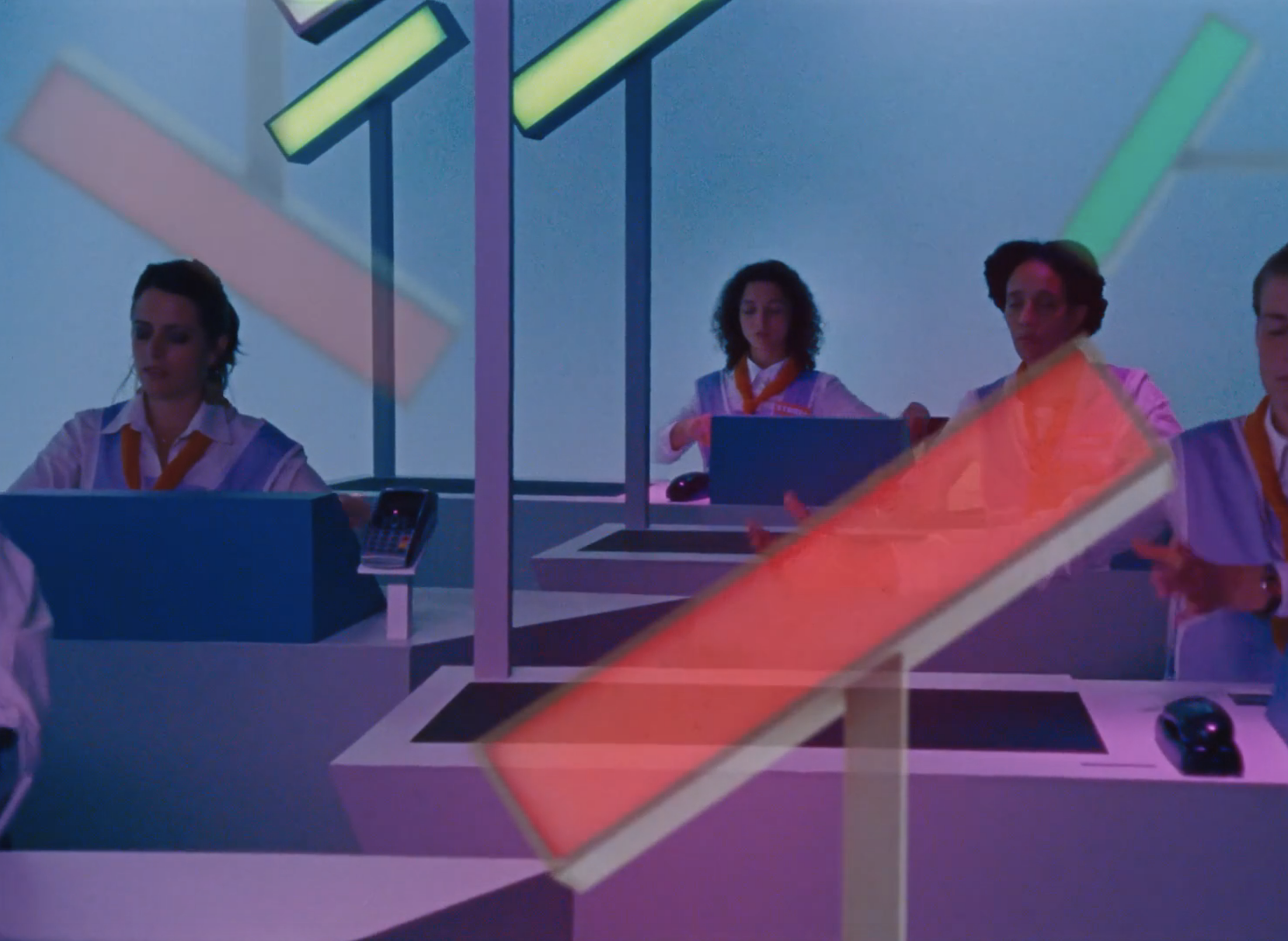
What guided your choice of tones for the “night” (or dream) sequence?
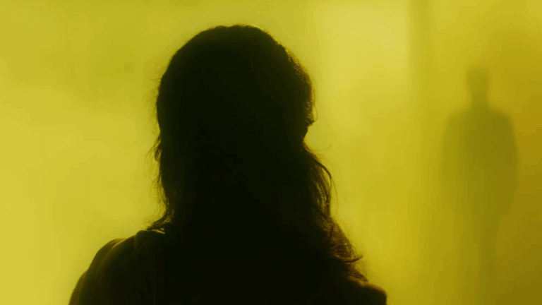
Sarah had sent me a reference photo that looked like the image below — hens in a large, dark room, lit on one side by a purple-coloured source, and on the other by an amber one.

So I tried to stick to that atmosphere, at once warm and cold, entirely unnatural.
With Guillaume Chaumet, my gaffer, we chose “surprise pink” from Lee Filters, which is more purple than pink, to light the checkout workers. And we cooled down the 18×4 TheLight fixtures (a kind of LED sunstrip) lighting the cyclorama as far as possible, to get that blue on the background.
I wanted a very even, flat light, but on a white cyclorama I knew I would barely need to light it at all — hence the choice not to go with tungsten washes, since once dimmed they would have had too warm a colour temperature.
The film is, in some ways, quite choreographed (very distantly, it made me think of Hal Hartley), within a world that is both conceptual and terribly realistic, which makes the film’s ending all the more devastating. The script is written so that its effect on the viewer is optimal, moving from satire to social parable — how did you support this intention visually?
Sarah brought in a choreographer beforehand to work on the checkout workers’ gestures, miming the scanning of non-existent products. In those moments, we were at peak derealisation. The return to reality happens in stages: first there’s the blood — in its quantity, its texture, and the way we filmed the stain on the floor — we wanted it to cut sharply against everything shown before. My experience on “gore” films taught me the importance of the nuances of red and their impact on the viewer. For this specific shot of the blood stain on the floor, I used a polarising filter to precisely control its degree of reflection. Then, the question of returning to reality came up when we had to choose the set for the toilets. We could have stylised them, like the supermarket set, but we opted for real toilets, while staying within the grey tones of the break room, and echoing, when the door opens, the white of the checkout area. Finally, the film’s last two shots — the corridor and the car park — are shot in a real supermarket, completing the return to raw reality. As a side note, the sticker reading “Am I giving the customer my best?” in the supermarket corridor wasn’t added by the art department — it was already there!
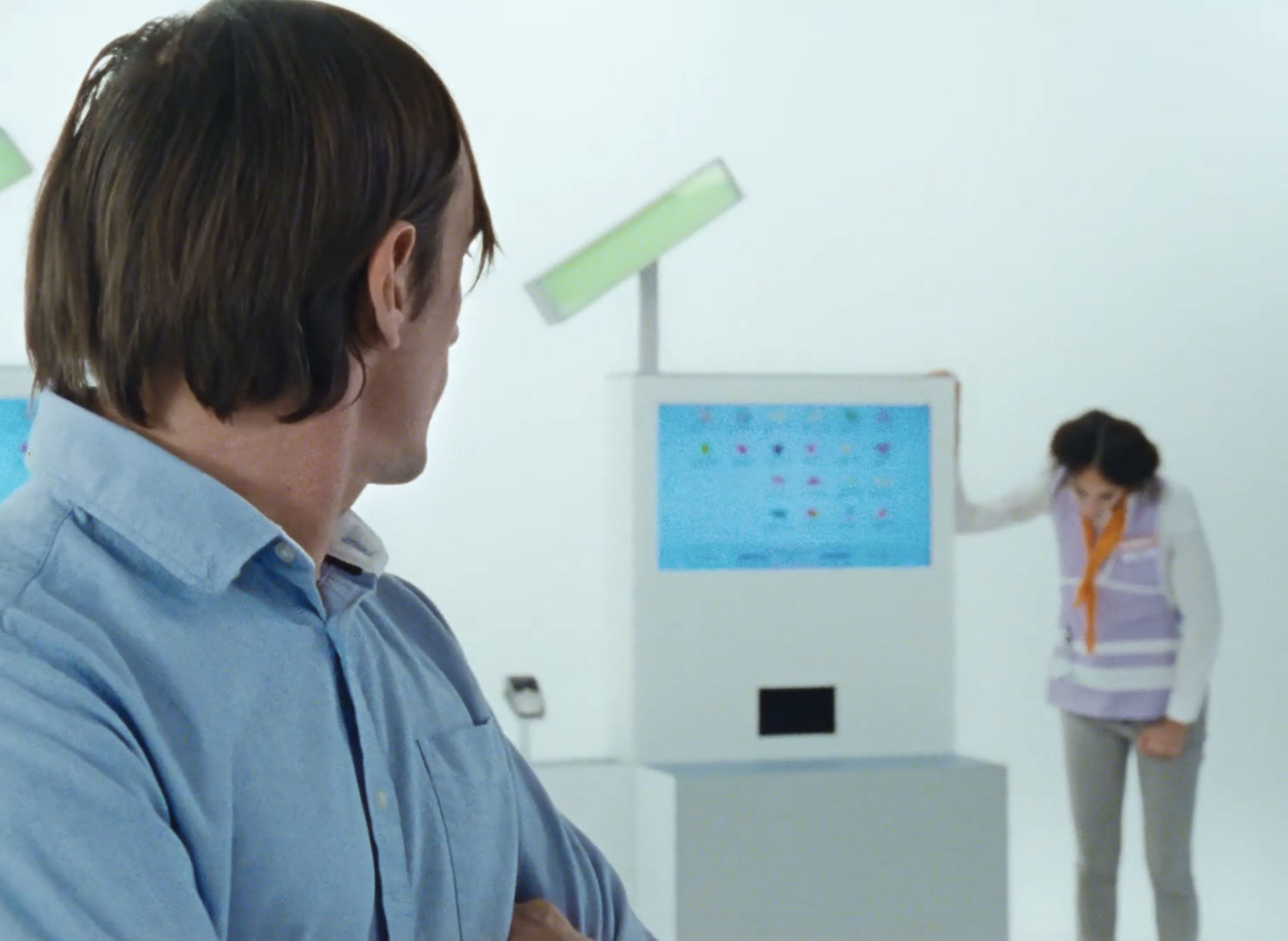
L’Effort Commercial
Director: Sarah Arnold
Production: Sensito Films, 5A7 Films, Twosa Films
1st AC: Charlotte Michel
Gaffer: Guillaume Chaumet