_ _ _ _
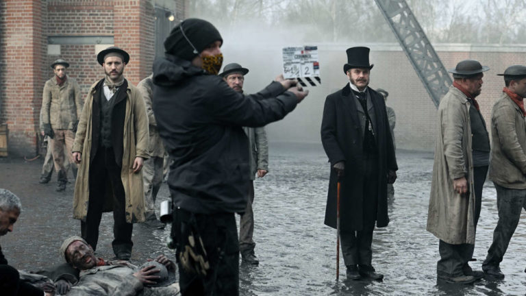
First feature film by Lauri Randla, who also wrote the original score for the film, “Goodbye Soviet Union” is a subtle and yet funny comedy that resurrects the last years of Soviet Estonia, through the eyes of a young boy to whom life does not smile every day.
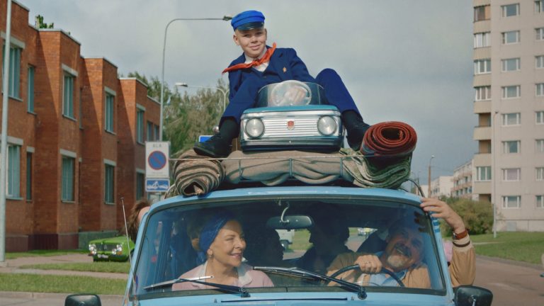
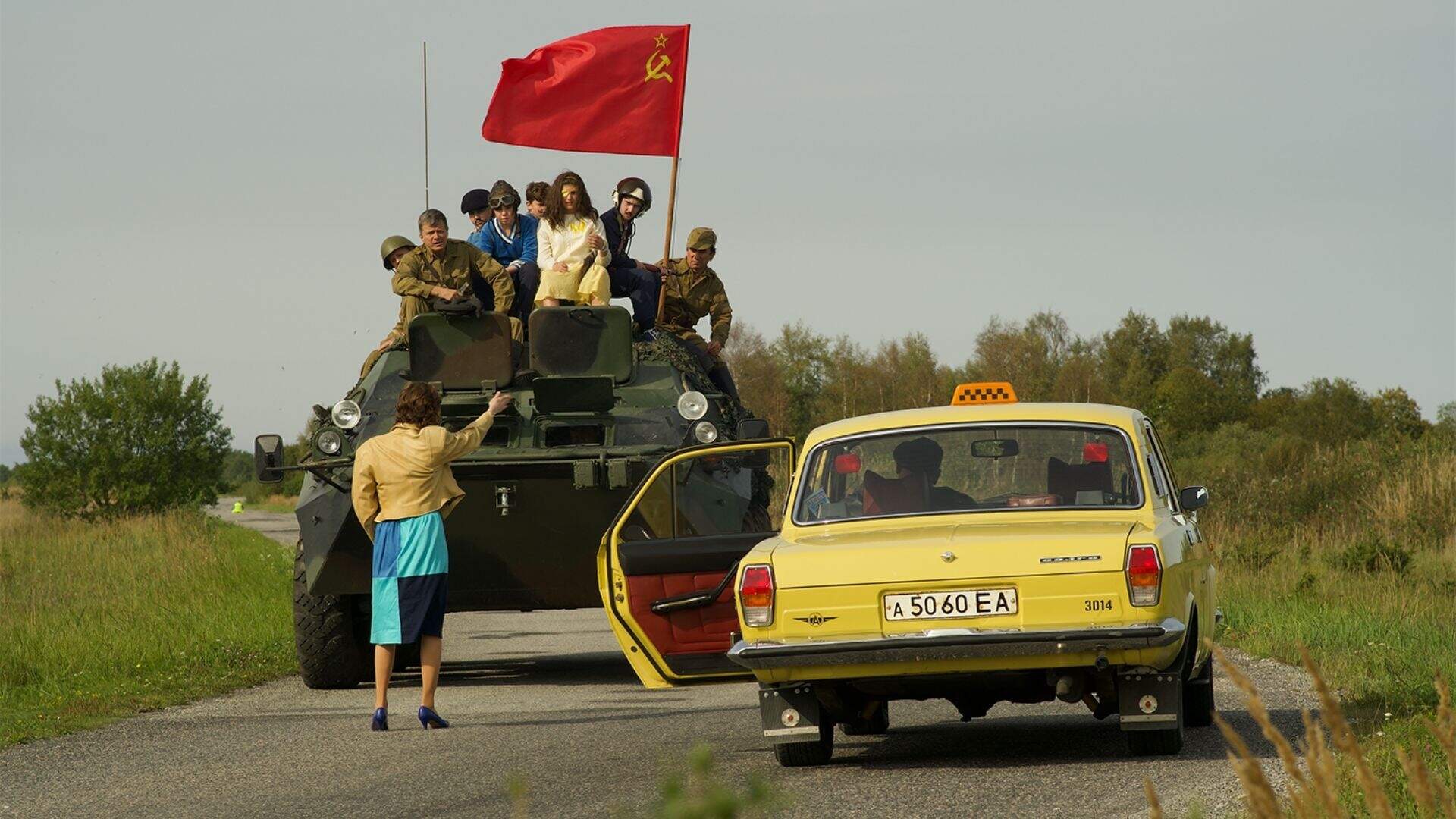
Johannes is born without a father into the Tarkkinen family, Estonians belonging to the Finnish community of Ingria. While his mother enjoyed intensively citylife in the early 80’s, Johannes grew up with his grandparents in Leningrad 3, a militarized city built on the Baltic Sea near a uranium processing plant, before the family was finally evicted. Then Johannes’ mother leaves to work in Finland, which the young boy experiences as an abandonment, but fortunately his budding love for Vera helps him through the joys and tragedies of everyday life.
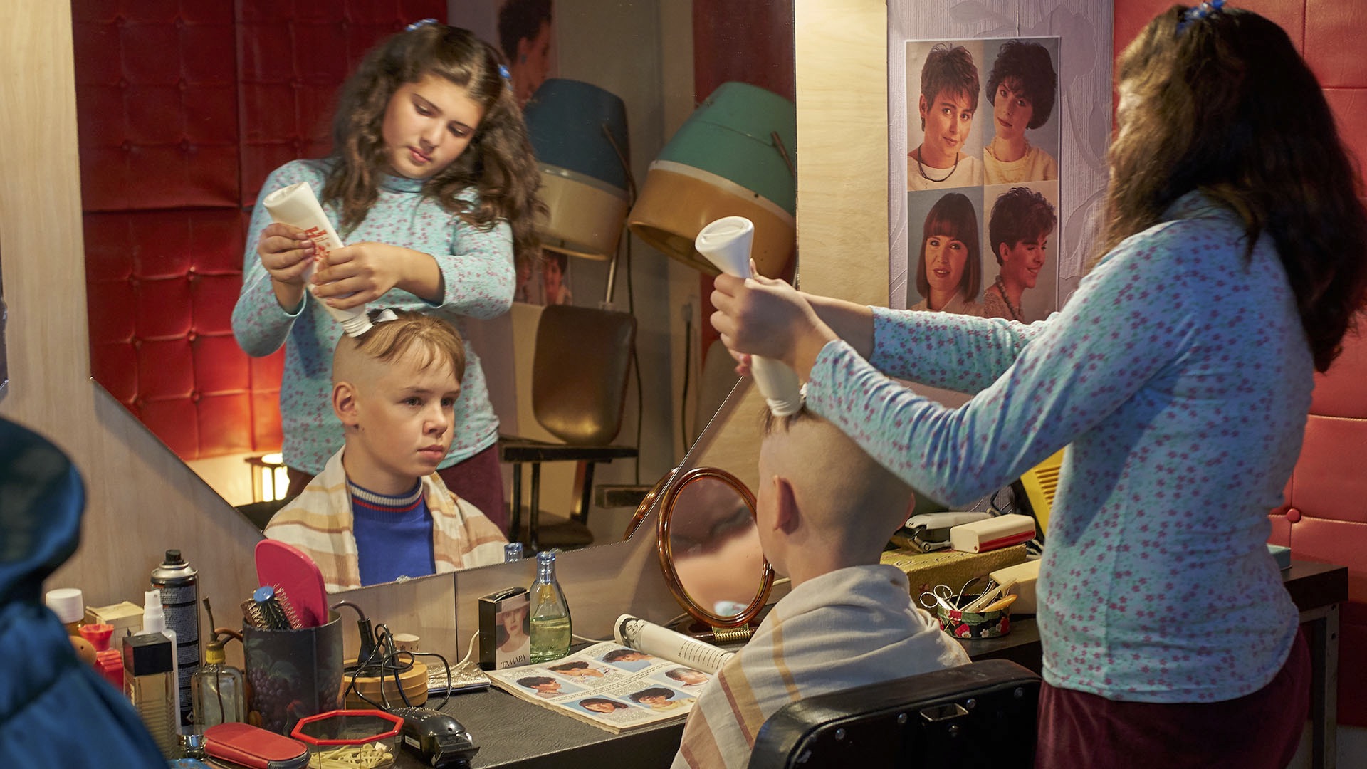
The story, very fluid, works as a grating tragi-comedy, which without nostalgia, tells of a country that has disappeared, but whose memories have fed the script. During the Q&A session at the festival, director Lauri Randla explained how he was inspired by his own memories, and also how he had borrowed certain autobiographical elements from his director of photography, Elen Lotman. It is notably about premature birth, dolls with the effigy of Gorbachev, an uncle beaten up by the KGB and removed from civilian life for several days, the unknown taste of bananas for the homo sovieticus… And the local melting pot, which was also found on the set during the shooting. People spoke Estonian, but also Finnish, Russian, English, sometimes Hungarian and also the Ingrian dialect, which tends to disappear for lack of speakers. We feel in the words of Lauri Randla and Elen Lotman that the film was shot in a warm atmosphere, nourished by the life experiences of each one on set, all these personal stories at the edge of History, at the end of the Soviet Union.
The image of the film, very mastered, soft and colorful, subtly serves the staging, especially the relationships between the protagonists. Even if it is a period film, in this case the 80s, the breakdown and the editing avoid the pitfall of a stylized nostalgia that could have been too demonstrative. Every aspect of the movie help the director to achieve what could be an uplifting tale of a certain childhood in a country that no longer exists. Beyond the “Glastnostalgie” so to speak… The visual approach of the film benefited from the experience and the formidable investment of its director of photography, also president of the ESC and since 2021 co-president of IMAGO, the international federation of associations of cinematographers.
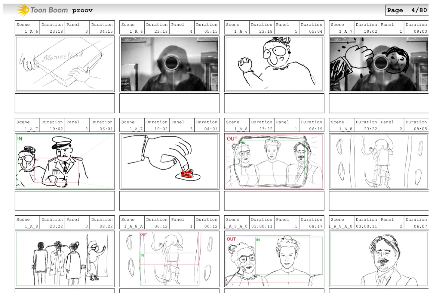
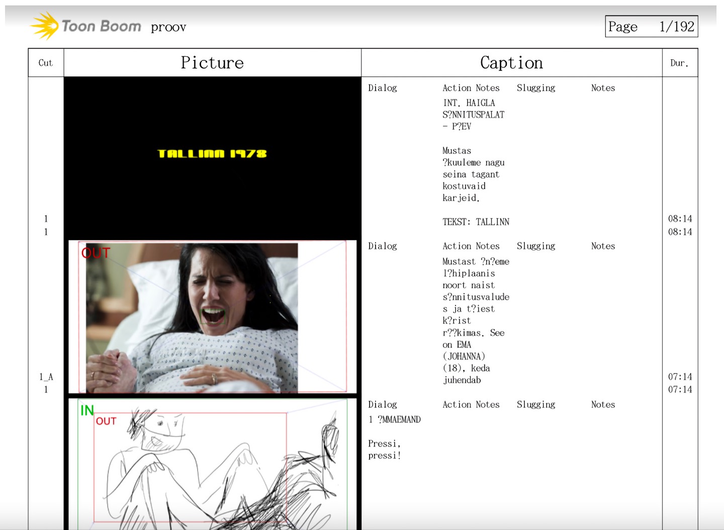
During the preparation phase of “Goodbye Soviet Union”, Elen chose to work with some tools that were new to her and that she learned along the way: the linguistic analysis software Voyant (https://voyant-tools.org), the animation storyboard software Toon Boom (https://www. toonboom.com) and the production planning software Studiobinder (https://www. studiobinder.com). Unconventional for image work and not well known to cinematographers, these tools, adapted for her own use, have become for Elen Lotman a solid basis for discussion with all the film’s location managers and a reference throughout the production.
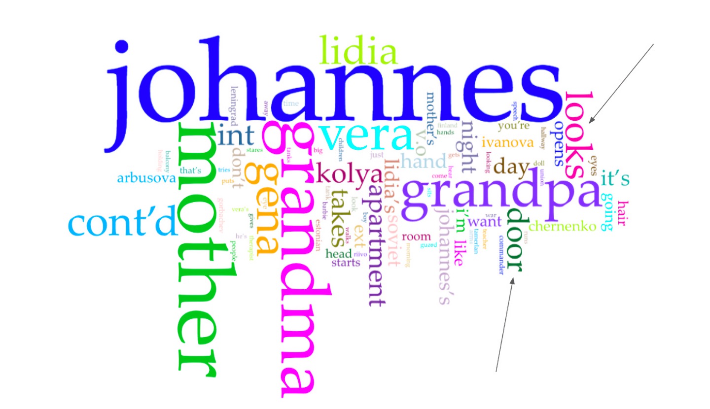
Examples of useful occurrences for cutting (door, manholes) generated by the Voyant software
What was the path to defining the look of the movie ?
As it often happens, we started with the first ideas, which by rule are the most stereotypical ones. The look of the development trailer that we shot for the film was really like the first idea that you get when you think “Soviet Union” – a drab and colourless place where only red on the flags pops out. In hindsight I am grateful that everybody hated it – the financiers, the producers and even ourselves. This pushed us to work harder, to look for more. For me it also shows the importance of failures in the creative process. There needs to be a felt impasse, that pushes you to go deeper and find images that are unique for the specific project.
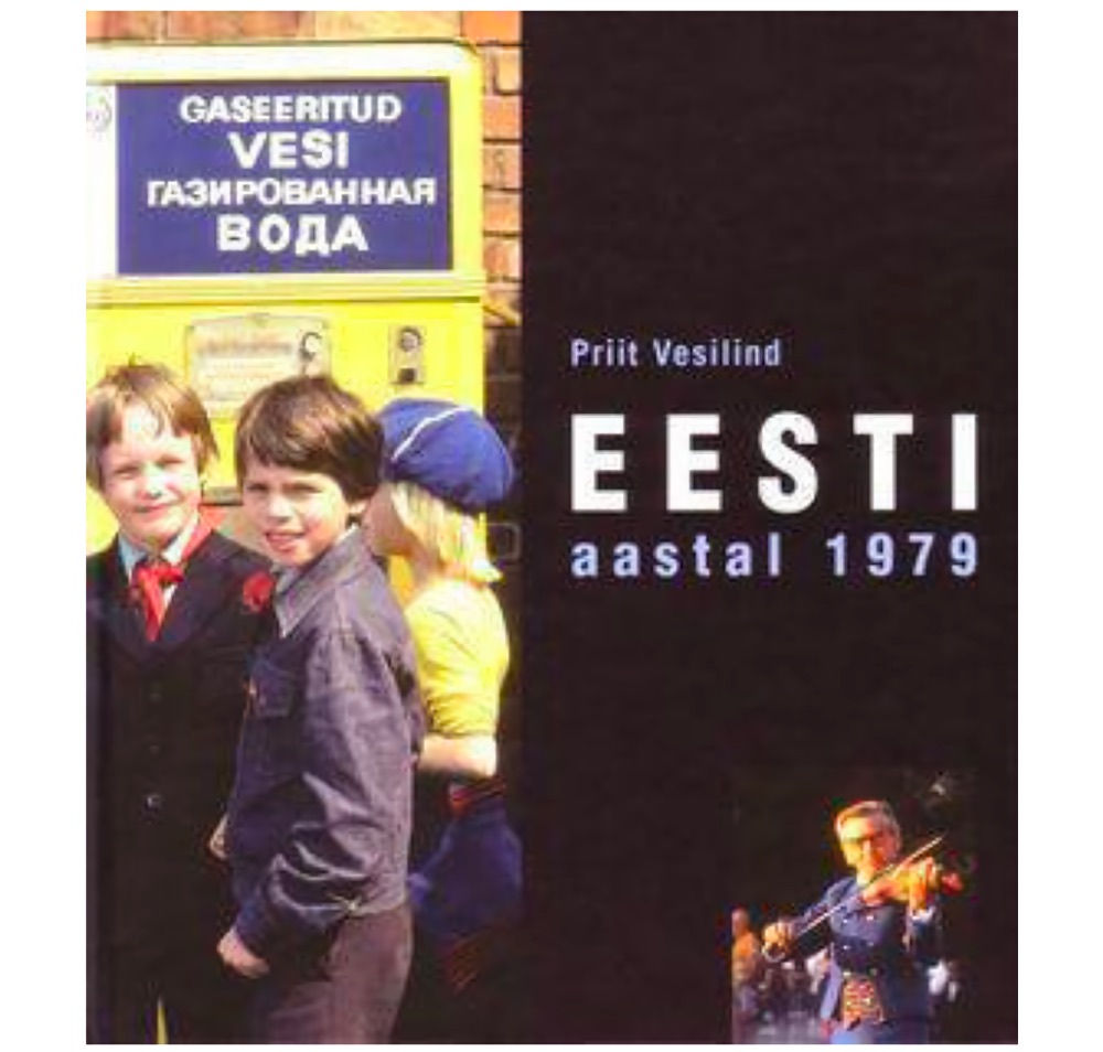
Then we found and used as an inspiration the rare view of an outsider, Priit Vesilind, an Estonian expat photographer, who came to Soviet Estonia in 1979, commissioned by the magazine National Geographic. His photographs of Soviet Estonia resulted in a published book ‘Estonia in 1979’. Vesilind used Kodak Ektachrome film stock that produced vibrant colors with a fuller spectrum and wider palette that showed a completely different image of life behind the Iron Curtain.
This became a major inspiration for the movie.
How did the use of color would help you to reinforce the visual perception of the characters ?
Thanks to the graph generated by Voyant, we noticed that Mother and Grandmother appear almost always together and realized that these characters almost always oppose each other. This led to the decision to represent the opposition by the use of a split complementary color scheme. According to researchist Hae-Sook Kwon, complementary colors appearing in the image together have an intensifying effect on each other, bringing out each other’s attributes.
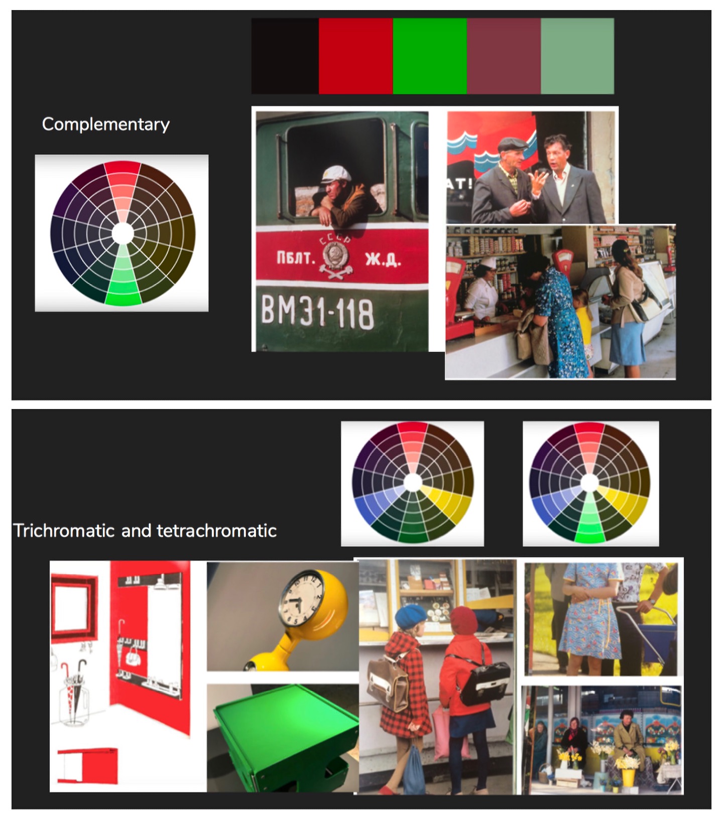
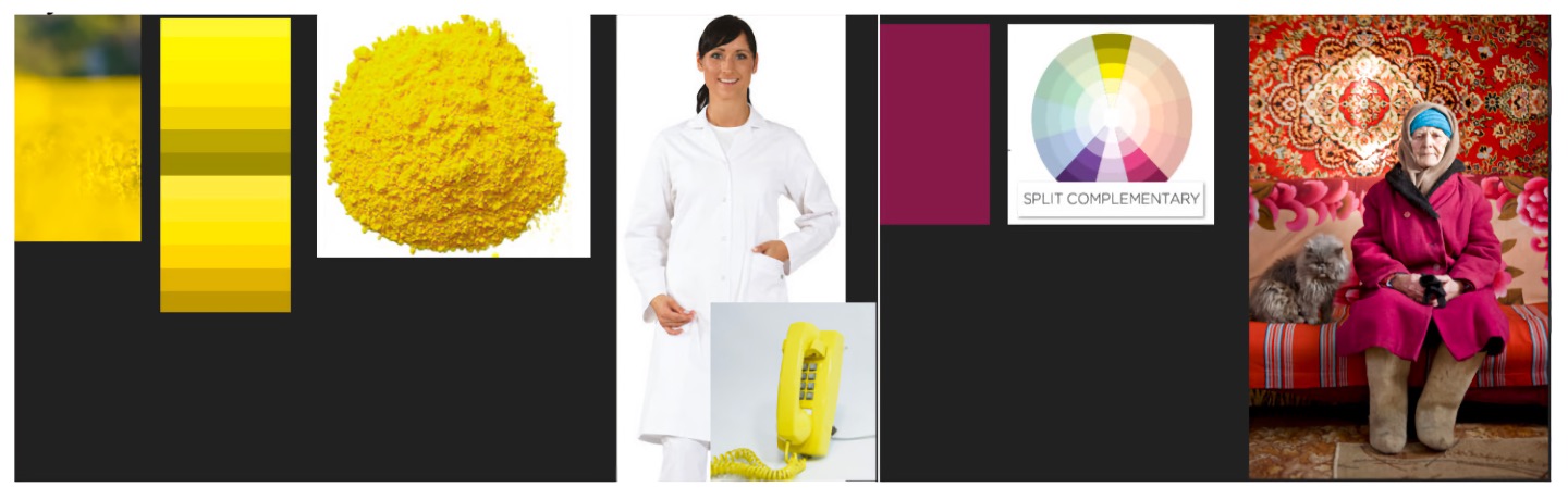
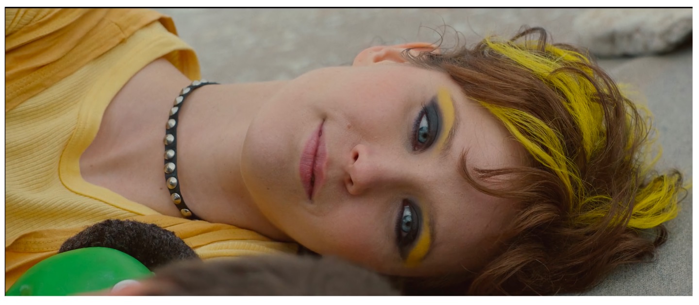
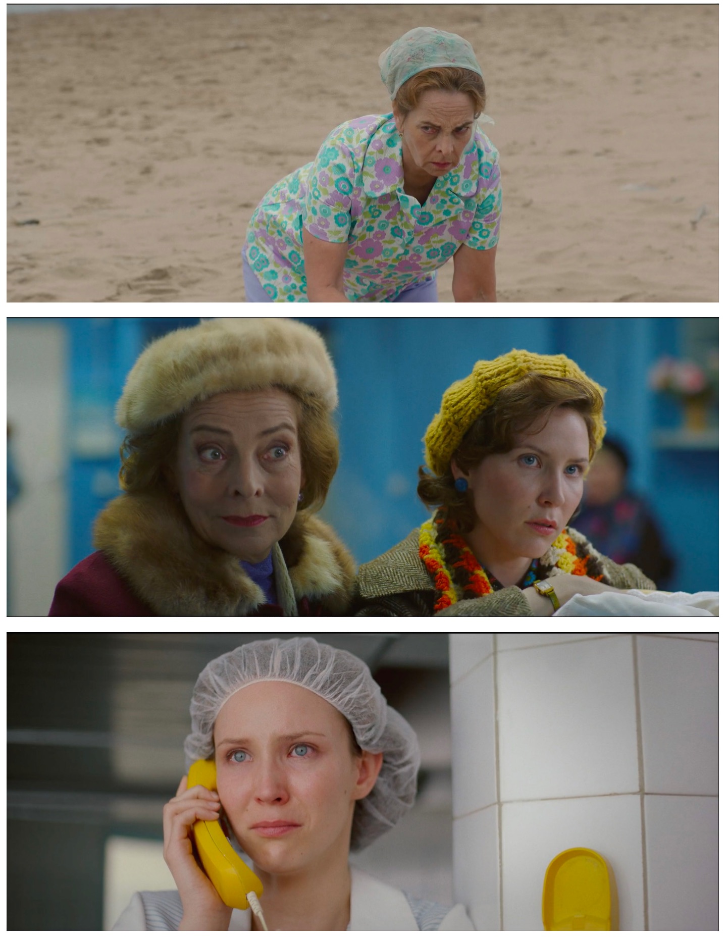
Thus, based on the Mother/Grandmother opposition we developed a color scheme within which Mother and Grandmother wear costumes made up from a split complementary color scheme (yellow-purple). In choosing the two colors, the starting point was one specific scene in the original screenplay: the field where children play their games was written as a field of yellow flowers. During the discussions Lauri, the director, mentioned that this yellow represents love in the story. Based on this, we devised a color scheme, where the color yellow starts disappearing from Mother’s clothing once she leaves to Finland and starts appearing in Vera’s clothes. During the moment with the greatest lack of motherly love, a scene with a phone call from Finland, Mother is wearing full white clothes; almost all love has left her, except for a small ray of hope — the phone is yellow, a lifeline between her and her son.
In order to have another angle on the characters’ appearances I looked into an option provided in the software called bubble lines graph, in which the data points are replaced with bubbles on the timeline. With a full overview of the script, it appeared that all of these characters : Soviet apparatchiks, Estonian nationalists, and fanatic school pedagogues, represent the outside forces that endanger the Tarkkinen family. So our idea was to develop a certain stylistic approach to show the weakening grip of Soviet power over the main character and his family in the film. This eventually led to using brown, dark green and other less-saturated colors in the costumes or in the sets of these characters, that contrasted with the main characters’ costumes.

What was your way of working on the storyboard ? Was it using photographs, drawings ? Was it a common work with the director, setdesigner, continuity supervisor or was it more like a solo intuition of what you were looking for in terms of framing ?
The storyboard was one of the development tools for the projet. I have understood that creative process needs to go through phases of widening and narrowing. Part of the widening was the different storyboard versions, so at some point we arrived to a storyboard file where I also added music mentioned by the director and sound recording from actors’ script readings, photos from real locations, photo references etc. But it was never meant to fix something fully, it was meant as a tool to move towards better understanding of what we are doing and as a tool to communicate.
What did your collaboration with the set designer looked like ? Was she involved earlier than you or did you start to work at the same time ?
I was involved a bit earlier, but as soon as she came on board, the three of us (production designer Jaana Jüris and director Lauri Randla) dived deep into the prep. I had worked with Jaana before, but not Lauri. My way of working is first to have very thorough joint script readings with the director and production designer, usually on a feature film it takes 2-3 weeks. After we are done with that, all the other steps are much more smooth, because we have a mutual understaning of what we want to do and we can commence on experimenting with the ideas of how we want to do it. It is strongly influenced by the functionalist architecture FFF principle (form follows function) and it has been very helpful.
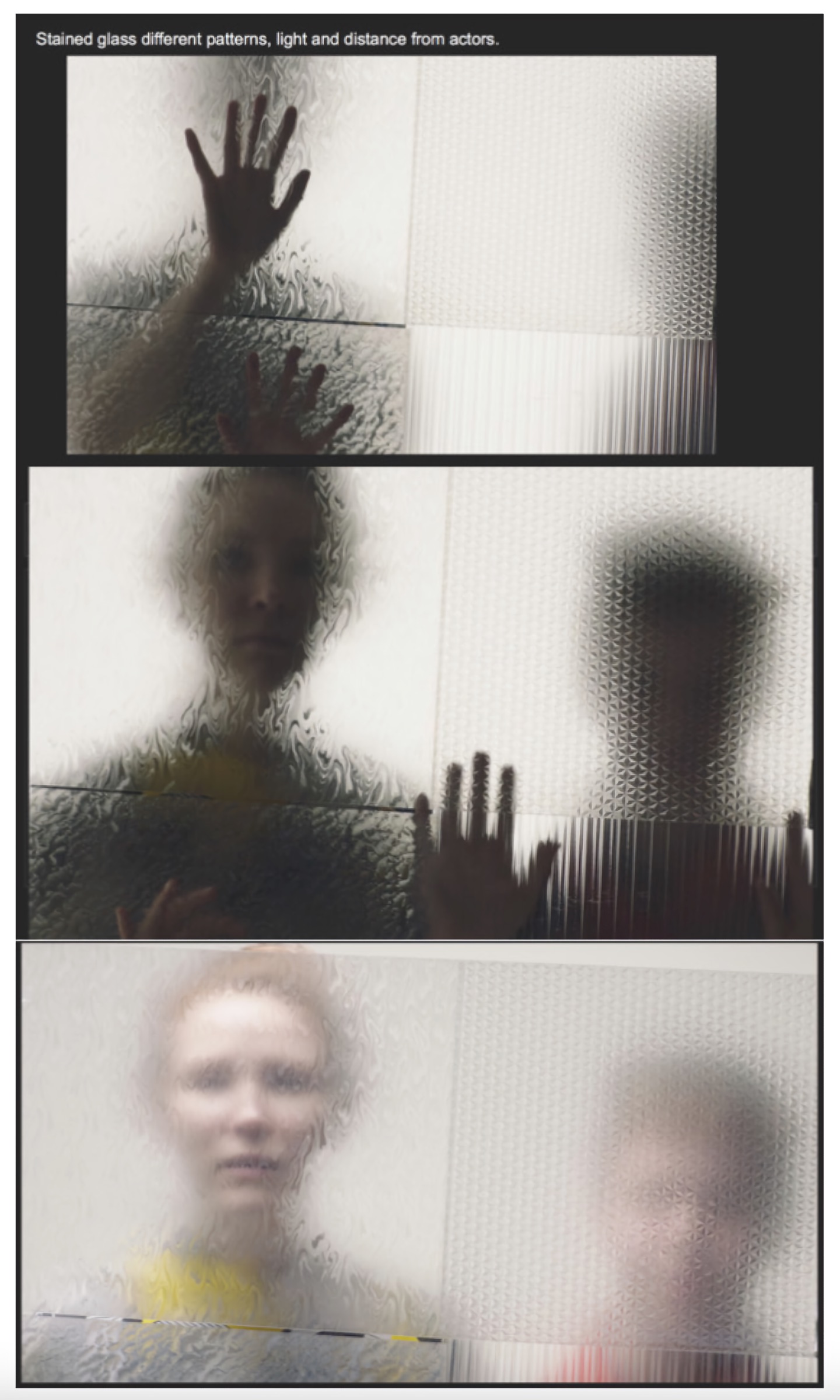 Rendering tests with different effect patterns for glass surfaces
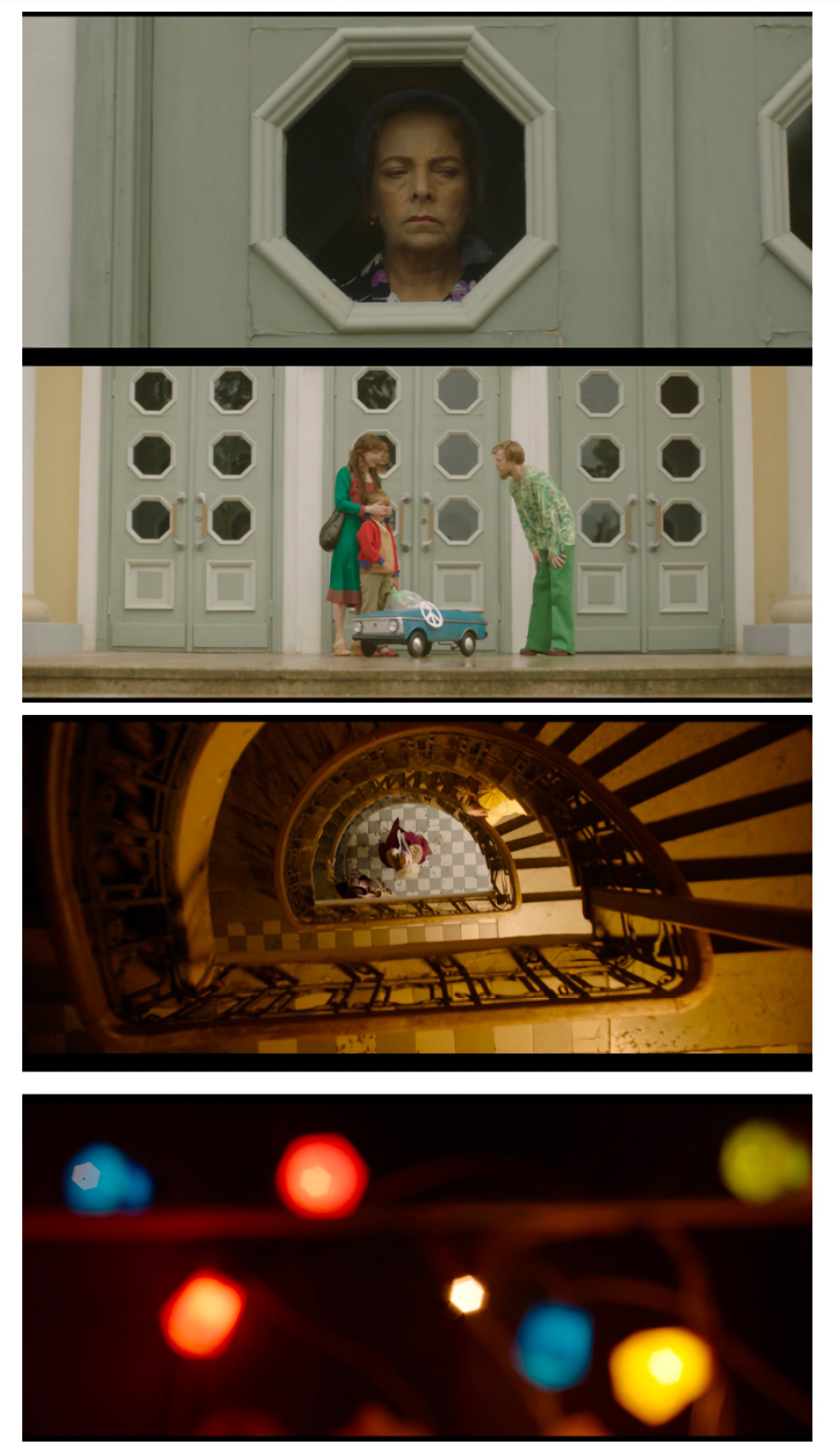
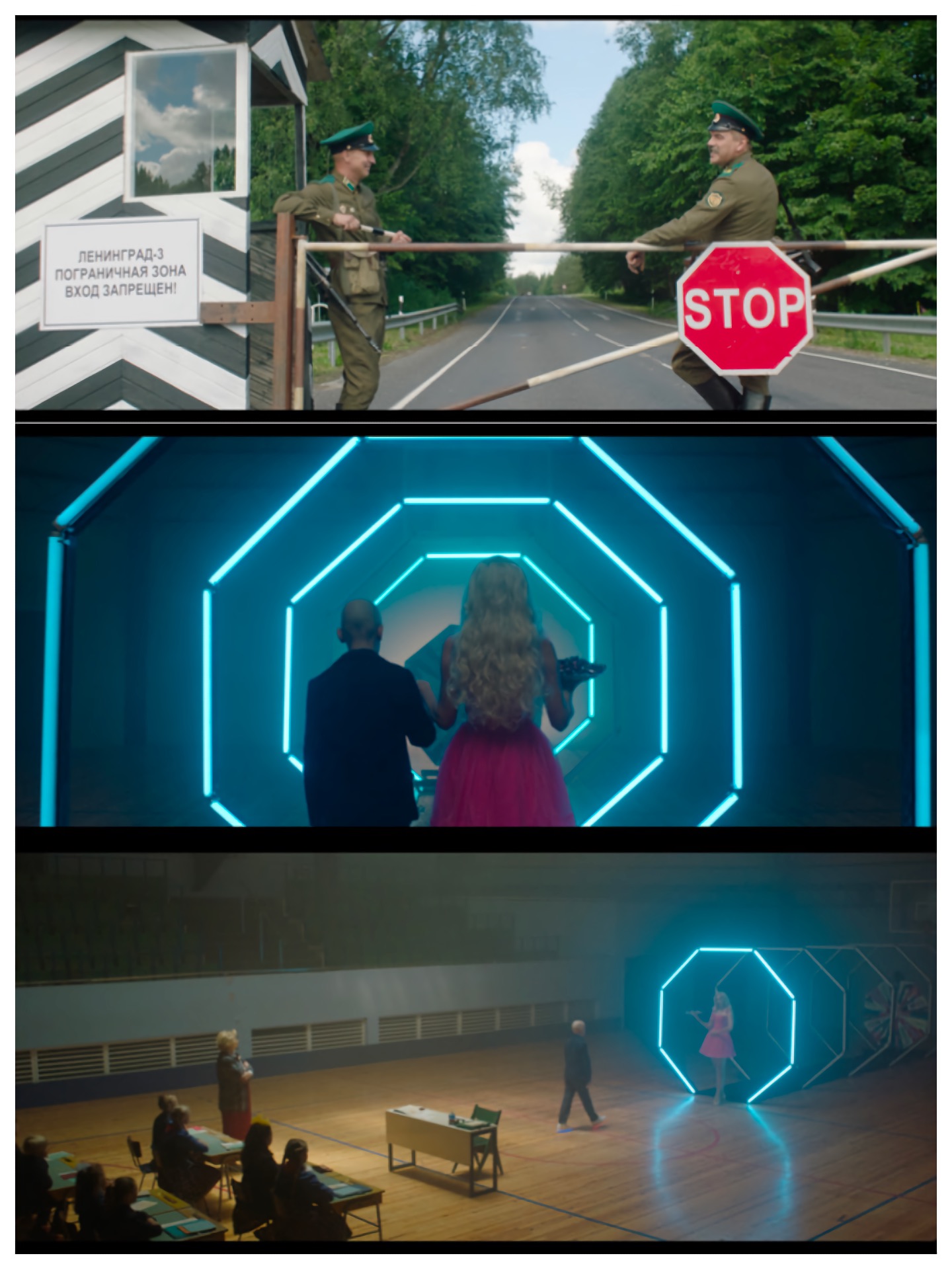 The octagonal shape, derived from architecture and common objects, helped structure the artistic direction of the image, through the decorative elements and even in the bokehs
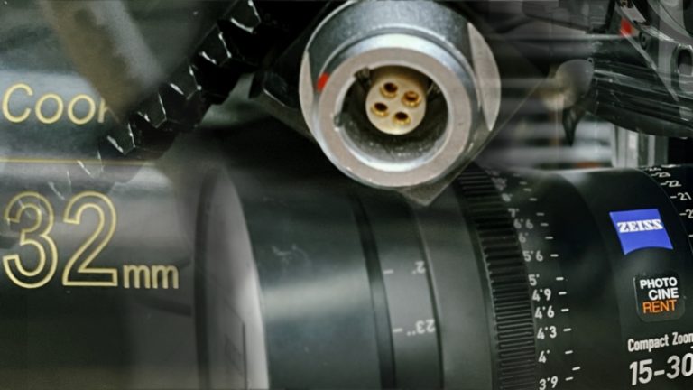
What was the camera equipment used on the project, and why ?
We shot on Arri Alexa Mini and Zeiss Opton lenses. The films that I have shot so far have major budget limitations so I usuallly try to work around the tools that are available, that I know and that would do the specific job.
Talking a bit about yourself, what led you to cinematography ?
As a teenager I was drawn towards film, because I was a restless troublemaker and maybe it both was able to hold me out of trouble for couple of hours and also show a world of excitement and wonder, as I was terrible with routine. In “Living the Light”, Claire Pijman’s documentary about Robbie Müller, Jim Jarmush reminisences that Robbie used to say that “filmmaking is like escaping on a travelling circus”.
How and why did you get involved in Imago, eventually becoming federation’s co-president ?
In 2011 I somehow found myself organising Imago General Assembly in Tallinn, Estonia, as a representative of Estonian Society of Cinematographers, ESC, one of the worlds’ smallest cinematographers’ societies. Then-president Nigel Walters BSC noticed me and for some reason still unclear to me, believed that I could be useful for IMAGO. He brought me in, at first as a deputy and from some point later already as a Board Member and since then I have dedicated my time to this wonderful organisation that will have its 30th anniversary next year.
Image work on “Goodbye Soviet Union” has been particularly well documented through Elen Lotman’s PhD “Experiential heuristics in fiction film cinematography” that was just released on Talinn’s university website, that I recommand you to read (and from which I’ve borrowed most of the illustrations).