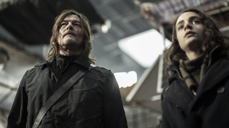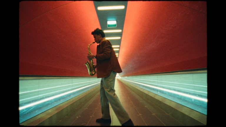
When Frank Bellocq first pitched me the series, with plenty of miming and sound effects, what struck me most was his insistence on the butterfly effect, with the quantum physics theory of temporal distortion: changing one link in your past life to create a new present for yourself, without controlling every aspect of it. References flew, from Back to the Future to Interstellar, by way of Groundhog Day and The Matrix, to feed the visual atmosphere of each episode.
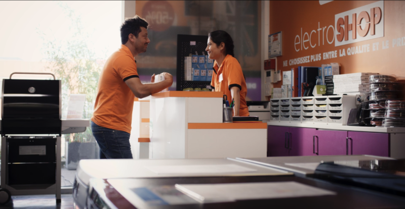
Eliott, in his early thirties, a modest salesman in a suburban appliance store, lives with his disabled sister. Looking for a way to earn more money so he can propose to his girlfriend, he decides to sell his old email address to a platform. The moment he hits send, everything shorts out. He gets a jolt, and when the power comes back, he finds himself in contact with himself at age 10. The two Eliotts then start communicating to try to improve their daily lives.
Telling the eras apart.
The story rests on running 2 distinct but synchronous timelines in parallel. The 2 Eliotts live the same September days simultaneously, in 2001 and in 2022. So we had to find a clearly identifiable way to distinguish each timeline. Even though, for obvious production reasons, we chose to shoot everything digitally, the initial idea was to get as close as possible to a film-like look for 2001 (the medium most commonly used at the time) and a smoother, more digital look for 2022.
Very early on, I did pre-tests to explore exposure latitude and image texture on 3 cameras: the ARRI Alexa Mini, the RED Gemini 5K (dual ISO), and the Sony Venice. From the start, I wanted to use 2 different exposure bases, one for each era, and to handle both the distribution of dynamic range and the look of the residual noise as if they were 2 distinct media. These tests quickly confirmed my approach, and I went with the Sony Venice, which I used only at its 2500 base. Its color rendering in X-OCN is very rich, and the grading possibilities in ACES on the raw files are impressive, especially given the constraints I had set myself. My first tests showed me that at this 2500 base, the rendering seemed more accurate at 2000 ISO. To clearly distinguish the eras, I therefore decided to underexpose everything by one stop for the 2001 part, rating the camera at 4000 ISO (but still set to 2000 EI), and conversely to overexpose everything by one stop for the 2022 part, rating it at 1000 ISO. On set, I had viewing LUTs that let me correct this exposure directly on the monitors. The result is an interesting grain structure and base dynamic range for 2001, and flat areas of color combined with harsher, less milky highlights for 2022.
On that basis, the visual evolution of 2001 relies both on increasing grain in the medium and on increasing lighting contrast. Young Eliott is constantly torn between his 20-years-older self and a manipulative shrink who quickly realizes that the child has a real gift, and therefore that he can use him. This manipulation erodes the young boy’s life and chips away at his carefree innocence, and so it adds noise to it! In the grade, I like to use a film emulation as a basis for contrast and color rendering. Using a DCTL replicating Kodak 5383, Stéphane Azouze, my colorist, quantified and graded the hardness of the image’s overall contrast, on top of which we then added S16-type film grain, from 0 up to 35%. I had set myself key scenes in the script to make this texture evolve, and I also hardened the contrast on set by playing with the main directions of light.
For the 2022 looks, we also started from the same print emulation, without adding noise. With this overexposure, the Venice gave a more metallic rendering, close to mercury, which interested me for all the sheen it brings. The highlights pop while retaining information. Over the 6 episodes, Eliott (played by Kev Adams) goes through 4 main realities, with 2 sub-realities. So we had to maintain overall consistency while making it evolve coherently. Each episode is named after one of the series’ characters, and Frank and I set ourselves a color palette that we developed around each of these characters.
- Reality 1 represents the initial situation, an everyday life that seems dull and trivial: the depiction of the ordinary.
- Reality 2 represents the illusion of social success, in which Eliott begins to lose his footing, just as he loses the woman he loves. Colder and more contrasty in tone than the previous one, it’s the beginning of the trouble.
- Reality 3 represents the illusion of success in love. It is deceptively warm before revealing all the tragedy hidden in the past. Purples, from red to lavender, enhance a springlike palette that ultimately offers little comfort.
- Reality 4 represents the peak of dystopia and nightmare. It’s hell on earth, with the loss of all bearings in space and time.
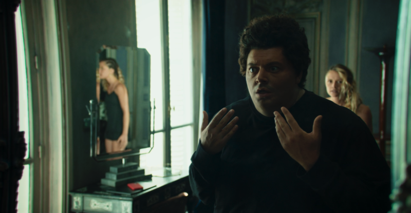
To accentuate this split, I wanted 2 different lens renderings. Thanks to the support of Frank Graumann at Transpacam, I was able to take 2 sets of primes: Cooke S5i and Leitz Summicron. The Cookes were truly fabulous, with a rendering that was warm, soft, and very sharp on the short focal lengths. I used a lot of flares, accentuated by the halo characteristic of Glimmerglass filters, which ended up truly defining the 2 protagonists, alternating light directions between backlight and three-quarter front light.
The Summicrons were ideal in their handling, their color separation, and above all their rendering of mixed color temperatures. I find their rendering very natural, which made them an excellent base for pushing them toward characterizations specific to each reality.
To play as much as possible on the possible flaws and bokeh of each set, but also to separate our characters from the background as much as possible, we shot everything close to wide open, that is, T1.4 on the Cookes and T2 on the Summicrons. So we very quickly ended up with ND 2.1 for day exteriors, given that for 2001 I was underexposing by one stop at 2000 EI, wide open at T1.4…
Color palettes & characters.
Each character, depending on their role in relation to Eliott, has their own color palette. Starting from color symbolism, we played on the meaning of each one.
Eliott: the chameleon. He takes on every color at once, depending on his state. His gaze guides us. The viewer shares his point of view. He alternates between dream and reality… A very rich, vivid color palette that follows his emotions.
Olivia: his sister. Warm colors, from yellow to orange. She is his ray of sunshine, the one who evokes the years of simple but true happiness. A symbol of the era he will never stop trying to recover.
Camille: his childhood friend and Olivia’s lover. Warm colors, from yellow to orange. He is the alter ego, the soulmate. A comforting, warm presence, protective and a confidant. He completes the pair that symbolizes the initial happiness.
Emilie: the woman he loves. Red. A symbol of passion and of physical and emotional attraction. She is also the anchor point that varies enormously from one reality to the next, making the happiness he seeks more and more unattainable.
Sofia: the mother. Black. She represents the trigger of Eliott’s distress, the one who will take him to Sax, the shrink, and sustain his hold over him. She is in mourning and takes us back to the death of the submissive father. She is the family’s shadow.
Bertrand: the father. Blue and gray. He is Eliott’s ally in the family, and he fades over the realities until his final extinction. A symbol of family unease and submission, then of absence.
Sax: the shrink. Green. He is both the heart chakra (the mother’s future lover, but also the one who digs into his patients’ emotions) and the key to the riddle, a symbol of healing. He presents himself as the therapist who comes to Eliott’s rescue. Then the green turns, clouds over, and dulls until it becomes swampy. He is the eel, the pike swimming through the mud, hiding behind his secrets and lies to protect his success. The manipulator behind Eliott.
Eva: the shrink’s daughter. Green and brown. She is the blood tie to Sax, the one who feels neglected by her father and envies Eliott’s place. She also embodies the ambiguity of her attraction/repulsion relationship with Eliott, which sometimes finds violent expression.
Camera movement and staging.
For 2001, we wanted classic, smooth camerawork. So we shot everything on a dolly, with a slider, or on Steadicam for the walking shots, and more rarely on a crane on a few important sets.
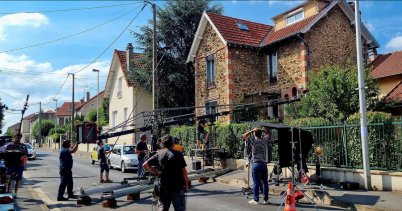
For 2022, Frank wanted movement, as if to suggest Eliott being sucked into a time loop beyond his control. The beginning is very fluid, to describe his initially banal daily life. We first used Steadicam, which became a Stab One from reality 2 onward, for a first shift to stabilized handheld that emphasizes Eliott’s first interventions in his past. This transition led us to a third part shot on the shoulder, from the moment Eliott completely loses control of his life to the shrink.

Grading and image processing.
The 2022 realities are clearly more “digital.” The contemporary period is therefore smoother and flatter. As soon as Eliott intervenes in his past and strays from his original timeline, this translates on screen into more and more visual distortion, with increasing chromatic and geometric aberrations. The urban and architectural environment imposes itself on him and gradually crushes him.
During the pre-tests, we graded distortion effects in steps so that they would evolve across the realities, and combined them with different chromatic aberrations depending on each reality’s dominant colors.
- Reality 1 (episode 1): no distortion; this is the banality of the beginning of the story.
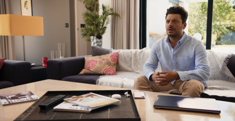
- Reality 2 (episodes 1 to 4): after Eliott’s first awakening, we discover a luxurious house and a high-tech environment. The house set was quite complex because of its vast windows, opening onto the outside over more than 270°, overlooking a southwest-facing pool. The whole space has many lines, accentuated at night by a blue-tinted LED strip in the drop ceiling, which let me bring the off-screen space to life through reflections. We combined a slight distortion (0.177) with a blue/yellow aberration to accentuate certain edges.

- Reality 3 (episode 4): this is the illusion of happiness regained and of fulfillment in love. The tone is therefore warm, with saturated reds. The distortion let me emphasize that there is nothing comforting about this reality and that Eliott keeps losing his footing without realizing it. We went up to a distortion of 0.22 and played with red/cyan aberrations. The field curvature brings an interesting imbalance to the perception of space, like a projection of Eliott’s state of mind.
- Reality 4 (episodes 4 to 6): this is the culmination of dystopia and nightmare, a kind of expressionist transfiguration of the environment. The house is no longer the same, but we find similar key features: light fixtures and many lines (broken and curved this time) highlighted by touches of greenish or cyan light. The distortion is at 0.30 in RGB, and we combined it with an aberration on the green/magenta axis, which visually heightens the unease, especially in camera moves.
Framing: compositions and lines.
We shot the series in 2:1, and it was broadcast in 1.97:1, the closest possible ratio to the original without cutting off the broadcaster’s logo. To avoid a crop, we sacrificed a little of our top and bottom safety margin.
From our first discussions and on reading the scripts, it seemed obvious to me that we should shoot as much as possible on short focal lengths, to bring the sets into the frame as much as possible. Our hero gets lost in his daily life, in his own environment. If we want to be able to identify and feel it, we have to see it. So we shot all our close-ups between 25mm and 32mm, at less than 3 feet. I like the presence this gives the actors and the feeling of great closeness it creates, a kind of empathy that is hard to fake. Given the large number of usable minutes we had to deliver each day, this choice very quickly imposed a demanding pace of work and rigor in managing the light on sets with depth and many visible areas.
In the composition, I wanted to play with lines and perspective to suggest the point in time where the 2 main characters (Eliott and Sax, the shrink) are. We worked with production designer Jacky Hardouin to establish patterns, furniture, and light fixtures on which this interplay relied.
One example is the final shot/reverse shot alternating between the two of them, across both eras simultaneously.
I like the idea that Eliott has a continuous line at eye level, turned toward the future in 2001 and toward the past in 2022, as a kind of confrontation with his destiny and his actions, whereas the shrink’s line is doomed to be broken, in a necessarily opposite direction, where everything begins and everything ends.
Acknowledgments.
I of course thank Frank for his trust, and warmly thank my whole crew, the suppliers, and everyone who contributed, each in their own way, to the result of this collective work. I am sincerely grateful to them.
Credits.
- Series of 6 x 52 min for TF1, My Family Production
- Director: Frank Bellocq
- Colorist: Stéphane Azouze
- 1st AC: Pierre Stetin, Claire Dabry
- Gaffer: Emmanuel Plumecoq
- Key grips: Gilles Houng-On-Seing & William Herrero
- Equipment: Transpacam, Lux & Grip – Didier Diaz & Frank Graumann.
- Stab One MkII: Access Motion – Nicolas Basset
- Lab: Hiventy Bastille – Delphine Grias & Aurélien Motard
- VFX: CGEV
- Specs: Sony Venice 1 in X-OCN ST, 4K, base 2500 @ EI 2000, 2:1 conform – post-production in ACES 4K on Resolve