Every film has its own aesthetic choices. Our directors sometimes come with their own unique ideas, sometimes with precise references, which can go as far as reproducing another work. In the example presented here, we will see how, despite sometimes limited means, one can draw inspiration from a pictorial work to extract its essence and use it in service of the narrative.
While preparing the short film Les deux Couleurs d’Ortance (FR – 2016) by Malec DÉMIARO, which will serve as our example, I had just completed a thesis titled Melancholia by Lars VON TRIER: a complex pictorial work. In it, I analyzed various pictorial inspirations of the Danish director, including notably Johannes VERMEER, the famous Baroque painter of the mid-17th century.
Driven by a shared interest in the work of this Dutch painter, we decided to design the aesthetics of the interior-day scenes of the short film based on this reference. The ambition was therefore to restore a Vermeer atmosphere while serving the narrative of the film.
The first step is to select the paintings that best suit the universe we wish to convey. Our choice falls on two works:
From these two paintings, we identify the elements that interest us and that seem typical of Vermeer’s selected works:
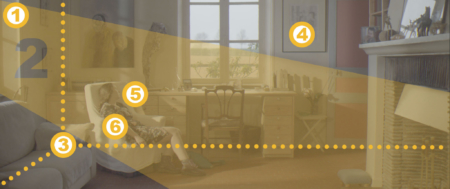
1. A window
2. A lateral, frank and white daylight entry
3. A frontal treatment of perspective
4. A set with warm hues
5. A character oriented toward the window (evoking melancholy)
6. A blue that stands out
In this short film, there is no desire for perfect reproduction or overly obvious quotation, but rather to reappropriate the codes of our references and reproduce them in our sets, with our narrative requirements and our technical means (limited). Furthermore, these references need to be placed judiciously within the story.
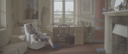
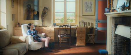
The sequence that seems best suited is located about a third of the way into the film, and allows us to introduce a short pause through a still image, like a painting, in which the character is discovered through a wide shot.
We then retain four photographic elements that will help us render this impression on screen: framing, lighting, set design, and wardrobe.
The framing draws from the characteristic frontal perspective. As the set does not allow us to position ourselves exactly as the painter did, we find a compromise where the window (large bay window) is slightly off-center. This lateral offset brings a slight depth and allows us to create a diagonal reinforced by the lines of the set.
Regarding the set, we guide the art department toward warm tones: a wooden table, beige-toned walls, the naturally warm parquet floor. These set elements will tend to shift the image toward warm tones, which is what we are looking for.
We also guide the wardrobe department to use a blue dress with small flowers (reminiscent of Delft blue, very present in Vermeer’s work), and ask our actress to wear her hair up, again inspired by the painter’s works.
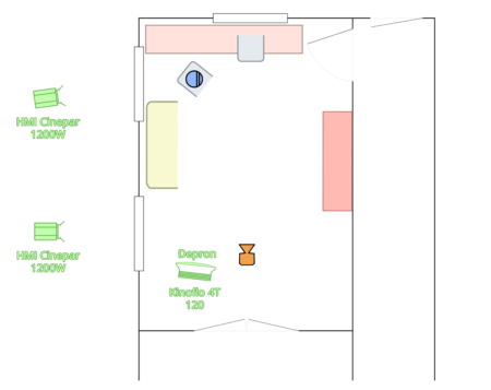
For the lighting, our means are quite limited but sufficient to convey this direction. We use two HMI Cinepar 1200W through the windows, lateral, as open as possible, and a Kinoflo 120cm 4-tube with Depron as fill light, to slightly lift the shadows.
Our daylight entries are not as pronounced as we would have liked, but they offer an initial direction that can be reworked in color grading.
It is when nothing moves anymore that we can find the pictorial characteristics previously identified:
1. A window
2. A lateral, frank and white daylight entry
3. A frontal treatment of perspective
4. A set with warm hues
5. A character oriented toward the window (evoking melancholy)
6. A blue that stands out
The elements are then imprinted on the sensor, in our own way. The character is not oriented toward the window on the left but toward the one in the center, the image is horizontal at a 2.35 ratio, the set was not chosen with this shot in mind, but all the identified characteristics are present and still give an impression of Vermeer.
It is finally the color grading that reveals and completes our aesthetic choice. We accentuate the daylight entry, we emphasize the blue flowers on the dress, we adjust the warm hue of the set and refine the rendering of the skin tones.
This example shows that it is less a matter of absolute mastery of a model than of dissecting it to infuse its characteristics into an image, with our constraints of narrative, set design and budget, in order to draw inspiration, explore, progress and attempt to compose something that best serves the narrative of a film and its director’s vision.
Shot characteristics:
Camera: Sony F5
Lens: Zeiss GO 25mm
Filtration: BlackProMist 1/2
Format: RAW 2K
Lighting: 2 HMI Cinepar 1200W, 1 Kinoflo 4T 120
Color grading: DaVinci Resolve 12
Film details:
Title: Les deux Couleurs d’Ortance
Director: Malec DÉMIARO
Production: 5 Bandes Prod
Year: 2016
Duration: 29 minutes
Aspect ratio: 2.35
Synopsis: Ortance is forced by her illness to put her studies on hold. Over the course of a summer, she must choose whether to resume them or enter the workforce.
Trailer: Allociné
Camera crew:
Director of Photography: Olivier WEINHEIMER
1st Assistant Camera: Edoardo MATACENA
2nd Assistant Camera: Paul COGNET
Chief Electrician: Rémy MALAN
Electrician: Victor MUSIC
Colorist: Olivier WEINHEIMER