At the 47th Manaki Brothers International Cinematographers’ Film Festival in Bitola, North Macedonia (September 19–25, 2026), the BVK, the German Society of Cinematographers, brought together cinematographer Johannes Louis and colorist Dirk Meier on stage. They had proposed a title built around the idea of uncertainty; the organizers preferred “analog versus digital,” sounding catchier and straight forward, but somehow less nuanced.
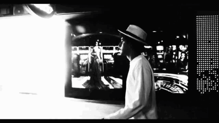
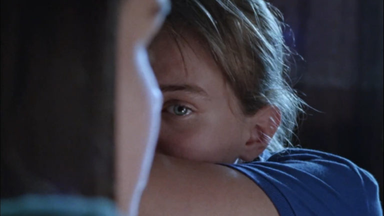
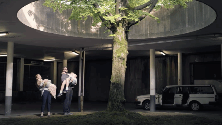
Their common thread: Retoure, a German feature by Jürgen Vogel, which Johannes Louis shot digitally with Ektachrome as his model, actually in the finishing stages. From the first lens tests to the grading suite, the two speakers walked through every step, with images to back it up. Excerpts.
The speakers
Johannes Louis, BVK, who trained in cinematography at the Filmuniversität Babelsberg Konrad Wolf, shot Cleo (Erik Schmitt, 2019), the series Druck and Das Leben der Wünsche (Erik Schmitt). He received the German Camera Award (Deutscher Kamerapreis) in 2017 for the short film Berlin Metanoia.
Dirk Meier, BVK, CSI, a freelance colorist, post-production consultant and lecturer, sits on the IMAGO Technical Committee. He graded Lars von Trier’s Antichrist, Sebastián Lelio’s A Fantastic Woman, Alice Rohrwacher’s Happy as Lazzaro and Roy Andersson’s About Endlessness, and from 2015 to 2019 he ran UP.GRADE, a long-form training program in color grading.
An orphan, a delivery driver and Ektachrome
Johannes Louis: Retoure is a very intimate drama. A 13-year-old orphan is trying to find her place in a community; along the way, she meets a parcel delivery driver, and a bond forms between them that lies at the heart of the script. The script is written, from start to finish, from the girl’s subjective point of view. That’s what led me to emulate the look of a reversal film, and more specifically Kodak Ektachrome.
Dirk Meier: There must be other reasons. How did you arrive at that choice?
Johannes Louis: It all goes back to my previous film, which was something completely different: a bigger project, for which we had built an entire visual world of our own. Technically it was very demanding, and a lot of fun. Toward the end, it became difficult on a personal level. I felt I was losing control of my image, to the point where, by the time I got to the grade, I was no longer quite sure what the original idea had been, or how to get it across.
Dirk Meier: So you can see which project we’re talking about, we have the trailer.
[The trailer for Das Leben der Wünsche, by Erik Schmitt, starring Matthias Schweighöfer, is screened]
Johannes Louis: That was the previous film, the one where we wanted to build a bigger world. Coming out of that project, I realized I needed a way to keep my vision intact from beginning to end. If I have a real photograph at hand, taken during the shoot, I keep a record of what I was after: that was the starting point.
The other side was how to tell the story of Retoure. We knew from the outset that the delivery driver would work for DHL: the big yellow van and its red lettering would constantly be in the frame. And I’ve always loved the way Ektachrome handles those extreme colors.
I figured it would be a good foundation, since the film would be full of them. I also wanted something naturalistic, whatever that word means; that’s a debate in itself. And I wanted to tap into the collective memory of cinema: all the films we grew up with were shot on film. Emulating that look places Retoure in the same family, in the audience’s eyes. To me, naturalism also meant an image that was less refined, less perfect, less polished.
Today, in the grading suite, you have so many tools that I sometimes notice how easy it is: add a bit of color contrast, put a window somewhere, bring an area down, add some light on the main character… You get an image that’s more pleasing to the eye, easier to read, and I feel it also becomes more generic, because everyone goes down that road.
You want a beautiful image that’s easy to read, and it can end up being boring. By emulating Ektachrome, and by borrowing the approach of an analog process, I wanted to restrict myself and keep just a few things to focus on.
Uncertainty and the blank page
Dirk Meier: That’s where our conversation started, when we were thinking about how to present your ideas. You had used the word “uncertainty,” which seems to me to fit the whole process. It’s where all of us start, like a painter facing a blank canvas or a writer facing an empty page: an infinite field where anything is possible.
Many see it as liberating, no limits at all, as the character in your film says at the beginning of the trailer: the world is yours, you can do anything, be anything. That freedom can also be intimidating: you get lost, you don’t know where to start, you’re afraid of losing your grip along the way.
Hence the value of constraints, of a guideline, of a few boundaries you set for yourself. I think that’s one of the reasons people love recipes so much: taking Ektachrome as a reference, like you did, or deciding to shoot on film, means relying on a formula you know, that you like, that has proven itself many times over and that spares you a lot of worry. Let’s see what you made of it.
Lens tests edited to persuade
Johannes Louis: So the starting idea was restriction, and at one point I had to explain that to the colorists: I didn’t want to use everything that’s possible. Let me go through the process from the beginning; it’s probably similar for everyone here. It all starts with the script, then come the moods and the ideas.
Some people do it in writing, which I find interesting; I, like most of us probably, use images, to find common ground with the director and the project’s core creatives. After those first discussions, I start the lens tests, to find a direction: a cleaner or more vintage image, softer or harder, and so on. What you’re seeing here was shot with the standard Rec.709 LUT, before any thought about the final look.
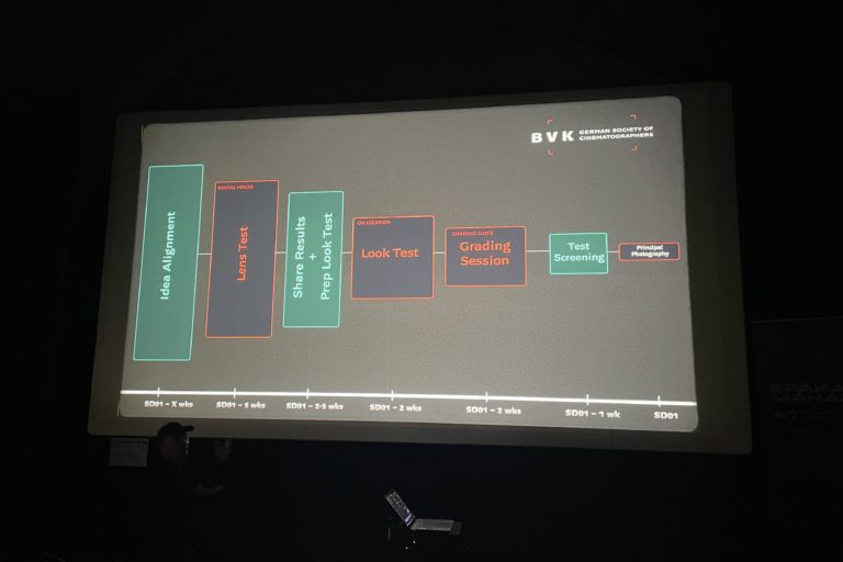
The test schedule, according to the BVK slide
A slide shown during the session lays out the steps on a timeline, counting back from the first day of principal photography:
- idea alignment: several weeks before (“X wks” on the slide);
- lens test, at the rental house: 5 weeks before;
- sharing results and prepping the look test: 2 to 3 weeks before;
- look test, on location: 2 weeks before;
- grading session, in the grading suite: 2 weeks before;
- test screening: 1 week before;
- first day of principal photography.
[Screening of the lens tests]
Dirk Meier: HS stands for High Speed, I assume?
Johannes Louis: Yes, High Speeds [Zeiss Super Speeds], with a filter. The other lenses were Cooke S4s and Sigma Cine primes.
Dirk Meier: How did you choose between filters and lenses based on these tests? The comparison doesn’t strike me as very scientific: a filter in the first part, none in the second.
Johannes Louis: I see your point. What I’m showing is just an excerpt. At the beginning and the end, there are the classic tests at the rental house, with fairy lights in the background, pans to look at the lens distortion, the depth, the whole set, and a few filter changes, though not all of them, because at some point it becomes too much.
I also try to shoot images connected to the film, or that at least evoke an emotion, rather than a dull technical image. Then you have to share this work with everyone: the director, the production designer, the costume department, the producers. From all these tests, I make a first choice, and this edit presents the decision I’d like to make, with a deliberate bias.
I show it to everyone, so they feel invited to react and can connect emotionally with the tests. An hour of camera tests: nobody would have the patience to sit through that.
Dirk Meier: So you form your own bias, and you narrow down what the others have to decide. Some directors, as we’ve heard, are very visual and want to understand the lenses and see the tests; apparently that wasn’t the case for you. You decide, you get your decision across, and perhaps you’re already trying to win people over.
Johannes Louis: Yes. I also tried putting Super 35 lenses on a full-frame sensor, to use the outer part of the image circle that normally goes unused and find even more aberrations there. That was part of the tests. If you compare the Cooke S4s with the others, the framing doesn’t match: the S4 image circle is so small that you can’t really go beyond Super 35; you gain barely 2%. The Super Speeds, from the 50mm up, pretty much cover full frame.
Dirk Meier: Do you want to talk us through these frames? The 35mm High Speed, again with the Glimmerglass filter.
Johannes Louis: Here’s the Sigma Cine, a full-frame lens, very clean, very sharp; then the Cooke S4. The person on camera is standing in the same spot, but the framing changes with the focal length. And if we go back to the Super Speed, you can see how soft the corners get: that was the idea, to find a lens that draws the viewer’s eye toward the center rather than the edges.
Audience member: At what stop?
Johannes Louis: Between wide open and T2. As soon as you stop down to 2.8 or 4, the character of any lens fades away and everything becomes very clean. So I stayed wide open or close to it.
Dirk Meier: On the 35mm High Speed, you can see it clearly in the leaves in the background.
Johannes Louis: Yes, lots of vignetting, and odd artifacts I could spot. I saw more of these real lens effects in a natural environment than during the tests at the rental house. There, technically, I could see things clearly: the rounder, bubbly bokeh, the cat’s-eye shape that betrays distortion. But to really understand what shooting with these lenses would be like, these images were far more useful than the technical test.
Breaking down a “look”
Dirk Meier: How did you communicate with your colorists? Or does that come with the look tests?
Johannes Louis: Let’s keep going, we’re getting there.
Dirk Meier: First I’d like to show you how I like to talk about the “look,” something few people are really comfortable with: students, since I teach a lot, but also experienced cinematographers. To convey what we want, we most often rely on reference images.
I get ShotDeck selections and mood boards, and I try to analyze them, to understand why a particular image was chosen. Sometimes, in the discussion, I find out it was picked for a tiny reason that had nothing to do with its overall contrast or palette. And when I try to understand more deeply what my clients, cinematographers and directors, see in these images, it’s sometimes a bit disappointing, almost superficial.
That’s why I made this diagram, which I’ve shown elsewhere. It breaks down the attributes of the image: color, but also texture, meaning everything spatial, such as lens distortion, vignetting, softness at the edges, and of course grain. Talk about the film look, and the first answer will be grain. Who can give me 5 other words that characterize film? The gate weave…
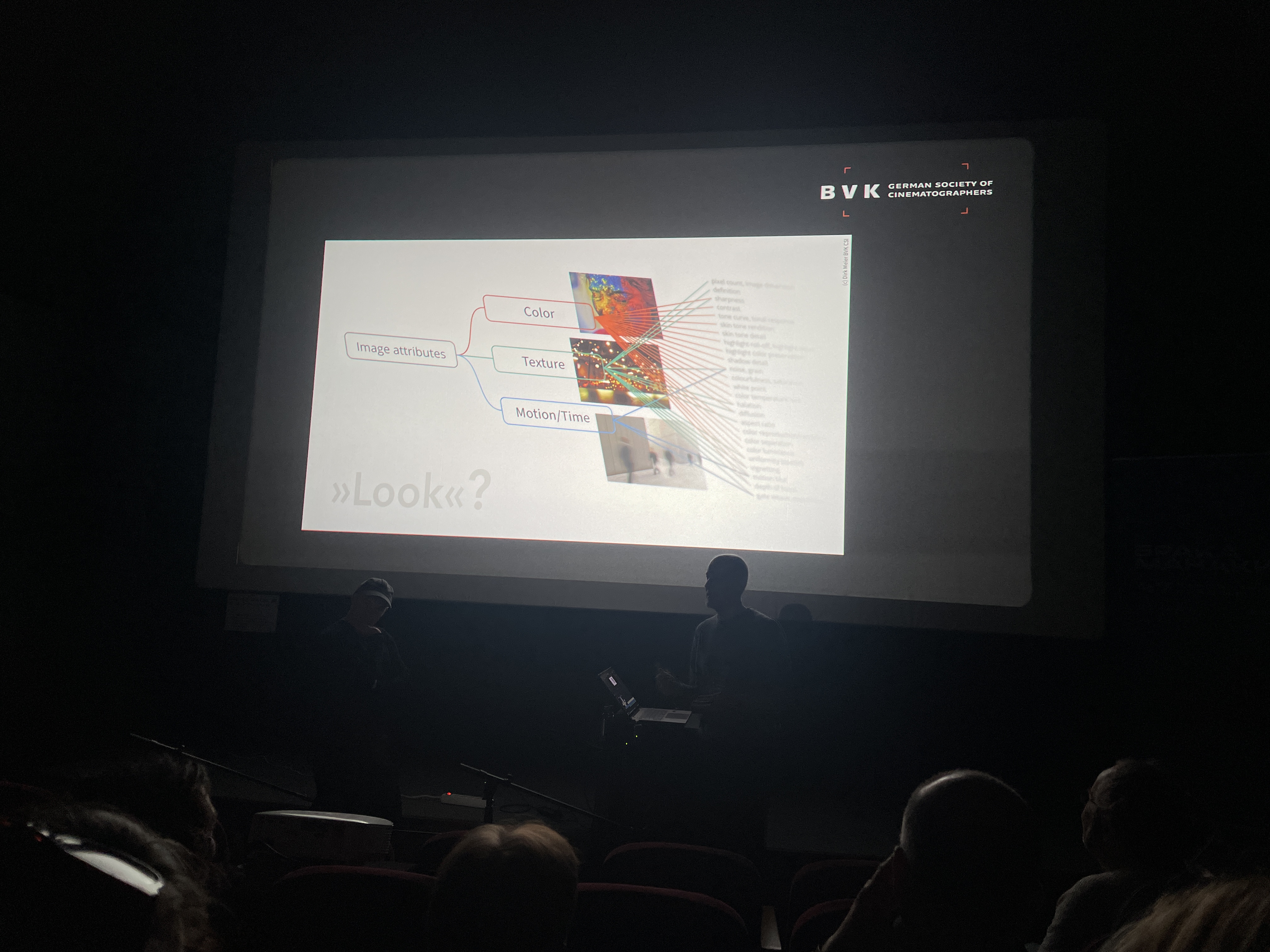
Audience member: What we imagine as the film look is very far from the real film look. When you watch old films, what’s striking is the saturation of the colors. We’re no longer used to seeing colors as saturated as those of real film, printed or scanned. When we talk about the film look, we’re already talking about an image transformed by digital and by the wish to look like film. It’s something else entirely.
Dirk Meier: Exactly, there is no single film look. Every image formation process has its ingredients, and the photochemical process does certain things in a certain way; it adds certain things. What we have in mind from film, what we’re still aiming for today, depends on which lab you’re talking about.
Labs have become less consistent, because they process much less film. And most of us in this room can’t afford to go to FotoKem, which is considered the best, or even to London.
There are so many variables that I’d rather we set aside “the” film look and try to understand the ingredients of an image we really like. By breaking it down, you communicate better, you understand better, and you choose your tools.
What do you do on set? Add more haze? That’s one way to give the image texture. You can also work in the grade, on contrast, or with spatial operations that are very sophisticated today and add a lot of texture. You can manipulate colors enormously. You can also, as Janusz Kamiński did in Saving Private Ryan, reduce the shutter angle and shorten the exposure time, to get that crisper, staccato motion.
Thinking in these categories, color, texture, motion and time, you end up developing your own terminology, and I believe that’s what helps you understand what you like in an image, and put it into words.
Looking like film, or like our idea of film
Johannes Louis: Let me come back to that. In theory, in the grade, you can transform a digital image until it’s identical to film. I think it was Steve Yedlin, a few years ago: he did the demonstration, and nobody could tell the difference. But once you’re sitting in the grading suite, you open FilmBox or some other tool: oh, halation, bloom, let’s play with the grain, ah, the 35mm grain looks good, a bit more halation, a bit less, that seems about right.
You build something, with the vocabulary and the tools, and I no longer know whether the image looks like film or like my idea of what it should be. Hence my decision for this film: to shoot Ektachrome stills throughout the process, during the look tests as well as during the shoot, to have a real reference image to show and to put next to the digital image in the grading suite.
Look tests, as close to the shoot as possible
Dirk Meier: To recap: we’ve seen the lens tests, and you chose your lenses and filters. Then you shot other tests, look tests, where you also put other elements in the frame.
Johannes Louis: Yes. I’ll go quickly; the approach is more or less the same for every cinematographer. Look tests happen closer to the shoot, about 2 weeks before. I try to get as close as possible to the real conditions: the actual locations if we’re shooting outside, or something similar, the costumes, the actors if possible, and if there’s anything specific about the lighting, I include that too.
Here’s what I shot: you can see some of the film’s colors, on the actual locations, and it’s already with the LUT we had developed. I knew we would be outdoors a lot, in very uncontrolled situations. To stay true to that idea of naturalism, I wanted to reduce my means of shaping the light and look instead for the right moments in whatever the location offered.
This is the location where we actually shot: I wanted to keep the weird, ugly fluorescent tubes on the ceiling, and to know what they would look like, so I’d remember it in the grade. At the bottom of the frame, you can see I had to test another camera: for budget reasons, the question came up of shooting on a different model.
Dirk Meier: In the end, you kept just one.
Johannes Louis: Yes, I shot on the Mini LF. I chose it for its handling; the other camera’s image was just as good.
Dirk Meier: In my view, these days you might as well go for ergonomics. Image-wise, all these cameras are excellent. There are differences, but they don’t really matter to me. You pick whichever works best for you in the field.
Johannes Louis: I’d add that it can be wise to pick the camera the post house knows well. With a model they’re not used to, problems can crop up along the way. Here is the actual Ektachrome slide taken during the look tests. Next to it, the image in Log C, and here, with…
Dirk Meier: The standard 709 LUT, I guess.
Johannes Louis: Yes, the standard 709.
One variable at a time
Dirk Meier: After these tests, a question immediately comes to mind. Some of you may have smiled when the person on camera walked through the frame holding the color checker. What use was that color checker, placed at random in the frame, for the grade?
Johannes Louis: We did use them, but not in those random situations. I shot the color checker in more controlled conditions, in the same light, with the camera and the stills camera side by side. In that shot, I simply wanted to give her something to hold, an action; I figured the color checker would do the job, and that at least it would add some colors. To match the look, we used just one image, where she was sitting…
Dirk Meier: I just wanted to make sure this doesn’t become the new habit: doing even more things at once in a single test shot, because unfortunately I see it a lot. The point of look tests, in the best case, is to be able to sit in a grading suite before the shoot with footage that represents what you’re going to shoot: ideally the locations, the actors, and therefore the real skin tones, and the costumes, so you can make meaningful decisions.
Too often, the actors couldn’t make it, so you film a random person with a different skin tone; you still had to decide on lenses and filters, so you mix filters and lighting setups haphazardly; you needed to know how the camera handles, so you add a handheld shot, and that’s it.
Every shot contains far too many variables to compare anything. If you want to choose between 2 filters, the shot should be about that choice only: locked-off camera, same light, everything identical, so that on a monitor or projected in a grading suite you can flip from one still to the other and see what changes for that single parameter, that filter, that lens, that lighting.
Johannes Louis: To be precise, I didn’t have the same lens: on the stills camera I was using an old Nikon lens, and on the Mini, the Super Speed. That’s a small variable I decided not to worry about.
Dirk Meier: One more variable, and we don’t know what effect it has in the end. It’s a different lens.
Audience member: How did you scan the slides?
Johannes Louis: I scanned them myself, and that’s a variable too: when I scan, I make decisions that get baked into the image; scanned differently, they would look different. I was aware of that, and I felt that even with those variables, we got closer to the actual positive than by doing without.
Dirk Meier: Another bad example: I’ve started a collection of more or less useless color charts, and if you have any, send them to me. This one comes from a student production. It’s good to have a skin tone next to it, but a chart half in shadow is useless, as is one under very contrasty lighting where you can’t make out the patches; and in this frame, it’s a bit small for proper color matching.
You were right to shoot the chart on its own. The chart is useful, but don’t expect miracles: even well lit, it isn’t enough for you or your colorist to perfectly match 2 cameras, because its palette is too limited.
Mind you, in your case, holding the chart in the frame adds a range of colors, and that’s useful to check how the LUT you created handles saturated hues. It’s a good tool, better than nothing. I also find it very valuable to film the LED practicals you now come across everywhere in the frame, on the street, in shops, sometimes nasty, hyper-saturated, super bright.
Without footage like that, it’s hard for the colorist to predict how a very strong look will behave. You’ve all seen those very saturated, very bright lights that, past a certain point, clip completely. To know whether the camera or the look is to blame, it’s best to have filmed some when possible.
Johannes Louis: I fully understand the value of a scientific test, with the chart well lit and everything planned. But once the shoot is underway, there are so many variables that you can’t test everything. So I like to create a bit of chaos, to do something less scientific, less easy to judge, that at least gives me an intuitive response to the image I’ve created.
I can see whether it works or not, without knowing 100% why, but at least I have a feel for it, and if I need to understand, I can dig deeper later. I hear you, and I know it’s important.
Dirk Meier: I can only work with the material I’m given. I’m here to support you, to help you figure out where you’re going, how you’re getting there, and how you’ll reach your goal: that’s my purpose. That’s why I care about receiving usable footage, so I can make the most of it.
On a film where a friend of mine was the cinematographer, it was agreed that I wouldn’t do the final grade: the production already had a contract with a Canadian post house. Since we’re friends, he asked me to prepare, remotely, at least a preview LUT for the shoot, more specific than the camera manufacturers’ generic 709 LUTs.
It was his first shoot on the Alexa 35, new territory: Log C4 is so different from Log C3 that you can’t bring over your trusted LUT from the previous project. The case interested me because there were 7 main characters, one of them Cate Blanchett, and he had only 5 to 10 minutes with all of them together, in a single setup, on a single day, for a test that had to cover hair, makeup and costumes at once.
He was also going to use a second camera, a C camera for some visual effects backgrounds, a Fujifilm. [The video is sped up here.] That was pretty much the only shot he did with all those skin tones, and it was enough for me. I extracted the color checker from a frame grab from each of the two cameras, put them side by side, and was able to create a LUT matching the Fujifilm to the A camera, the Alexa 35.
I also had very good skin tone examples, and the costume, the only costume Cate Blanchett would wear in the film, so its color mattered a lot. I could focus on what was essential. The team liked the LUT so much that the recipe was passed on to the Canadian post house, which built it into its own grading pipeline: instead of applying the LUT as is, the colorists recreated in their own tools the grade it contained.
Johannes Louis: I’d still be missing the locations, the texture of something other than a dark room. For matching cameras, it makes sense, and for seeing the costumes too.
Dirk Meier: That wasn’t his only test. Without the actors, he also shot in a forest.
Johannes Louis: So he did go on location; he didn’t settle for a scientific, technical test.
Dirk Meier: He had the same instinct as you. But you also wanted to show us something else.
Dailies more flattering than intended
Johannes Louis: Yes. During the shoot, I kept taking slides to compare with the digital image. As for the process, there was no DIT on set: a dailies grade was done at the post house and applied to the dailies as well as to the footage sent to editorial. You can click through. Here’s the LUT: at one point, I decided to go cooler.
[Dirk Meier toggles between the images.]
Johannes Louis: So the LUT is a bit cooler than the slide, and more contrasty. That may be down to my scan. Still, when I get to the grade, I’ll at least have a reference I can look at and say: this is what I wanted to achieve.
Dirk Meier: Is the camera’s white balance set to 5,600K?
Johannes Louis: It depended on the situation; I played with it a bit. When I decided to go cooler, I did it through the white balance, but most of the time it stayed the same, except in mixed lighting, where I adjusted it slightly, and not for every scene.
Dirk Meier: From now on, he’ll shoot everything at 4,300K, since that’s what Dan [Laustsen, honored this year with a lifetime achievement award] does.
Johannes Louis: If I can control every light in a room, that might make sense: reducing variables is always a good thing. Let’s move on to the next one. Here’s the Ektachrome slide. And here’s the frame grab with the LUT, the way I wanted it: a very strong tungsten feel. But the dailies colorist thought a bit more color separation would be interesting, and this is how the dailies turned out.
This is what everyone sees in the edit, and what I’ll see when I get to the grade. If I don’t have the memory of this image, I might say to myself: oh, that’s rather interesting, having forgotten that I wanted to go in the other direction.
Dirk Meier: I totally understand. When I saw your image, I thought: this is really flat. Almost every colorist, I think, has a natural tendency to avoid flatness: an image looks more interesting when it has depth, when the eye is drawn somewhere; the flatter and more monochromatic it is, the more lost you get, without knowing where to look.
So I fully understand the dailies colorist, who thought: let’s balance out these very warm oranges. You can also see that the image gets a bit muddy, and not very interesting either.
Johannes Louis: It is more pleasing to look at, in a way, and more generic too. That’s where I am at the moment, depending on the project: a pleasing image may not always be the right goal, because it has become so easy to achieve. If everyone does the same thing and you want to stand out, that’s another direction to take.
Dirk Meier: I’d say that if you want to serve the emotion of the story, pleasing isn’t always the emotion you’re after.
Johannes Louis: Exactly.
Dirk Meier: I completely understand that this slide is a good anchor for you, something to come back to in a year, when the edit is finished and you’re sitting in the grading suite.
What if the colors are ugly?
Audience member: A question for both of you. When you’re faced with colors that are frankly ugly, that don’t go together… You’ve already said that you wanted this authentic look. The DHL red and yellow, with that skin tone, personally turn my stomach, and if I had that job, I would change those colors to make them work together.
Same with Cate Blanchett’s pale pink sweater, which doesn’t suit her complexion at all. How far can you, or would you, intervene, or back the cinematographer in asking the costume department to avoid a particular color?
Johannes Louis: Your question amounts to arguing for an image that’s pleasing to the eye. I can’t speak for that film’s cinematographer or for Cate Blanchett, only for myself. Kodak developed its own color science, and the process transforms certain hues. What Ektachrome does to yellows and reds, I find beautiful: the red becomes more muted, and the almost neon DHL yellow is toned down a little, in a way I like.
Dirk Meier: They also get darker, I’d say, because of the subtractive process.
Recorded at the Manaki Brothers festival. Transcription and editing: UCO editorial team.