Blood Rider – Red is for Life
Blood Rider is a short documentary directed by Jon Kasbe and DP’d by David Bolen. Their film competes at Camerimage as one of the best photographed short docs of the year. It can be seen here on Vimeo.
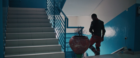
David and Jon are both cinematographers, and their tandem on this film is an example of what’s possible to achieve, even in natural light and chaotic situations. Here with motorcycle riders that carry blood bags through Lagos (Nigeria).
David was kind enough to answer my questions.
I recommend that you read his answers before playing the movie.
If you had to summarize the look of this film, how would you describe it ?
In general, our goal with this film was to make it feel as intimate and realistic as possible. We primarily shot on a 35mm prime lens, which forced us to stay close to the action rather than relying on zoom lenses to get close.
When we wanted a close-up of a character, we had to physically get close to them, and I think the audience can feel that intimacy in the visual style.
We shot handheld for the entire film, and embraced the chaos and instability that came with that.
We wanted the audience to feel the madness of what it’s like riding motorcycles at high speed through Lagos.
And in order to achieve this “mood board”, what was your strategy to control your pictures in the chaotic life of Lagos ?
Controlling the look is always really challenging in documentary filmmaking because you’re dealing with natural light and available in most situations.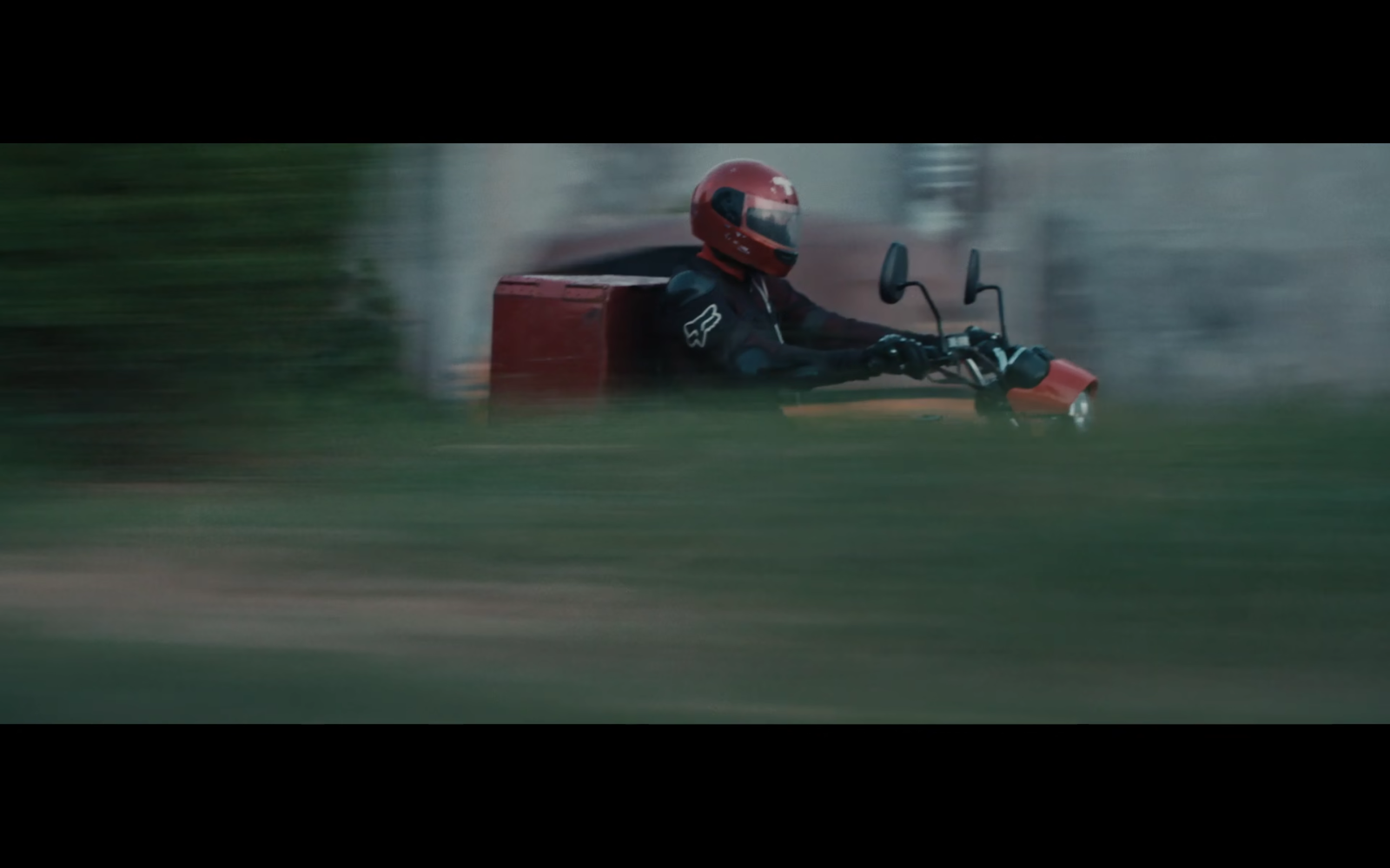
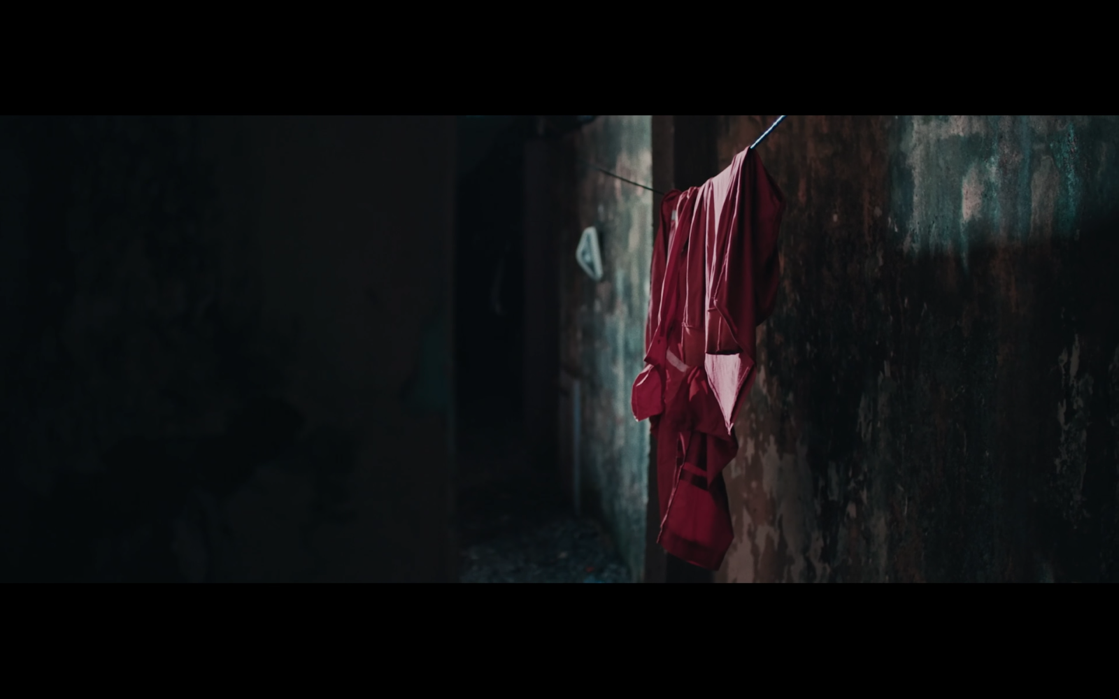
The color palette is unusual and puts “blood reds” in the foreground, but in a very subtle way. Red is normally an aggressive color, and simply desaturating it makes it look brown. How did you control that ?
The color red obviously plays a huge role in this film as it’s a representation of life.
On a more simplistic level, it’s also the color of blood. We were lucky that the riders had red uniforms, and we tried to keep them in that outfit as much as possible. It created a great pop of color that separated them from the chaotic backgrounds of Lagos.
To go with our gritty look, we desaturated the red slightly in post, so that it didn’t feel too vibrant or distracting. To answer the question honestly, we got very lucky.
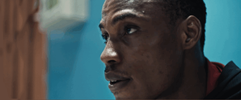
The gritty atmosphere of the “Joseph part” of the picture seems to come from your use of available light. Did you add “film sources” and/or practicals ?
For the most part, I try to use available practical lights. My approach is simple – turn off all the practicals behind the camera, and turn on all the practicals behind the subjects. This creates a beautiful rim light on the characters.
This particular location mostly just had overhead lights, which didn’t look great. As a simple lighting kit, I brought a few batteries powered quasar LEDs to most locations. I turned off all the overheads, and placed a 2-foot quasar in the far background. You can see this adding some rim light to Joseph’s face.
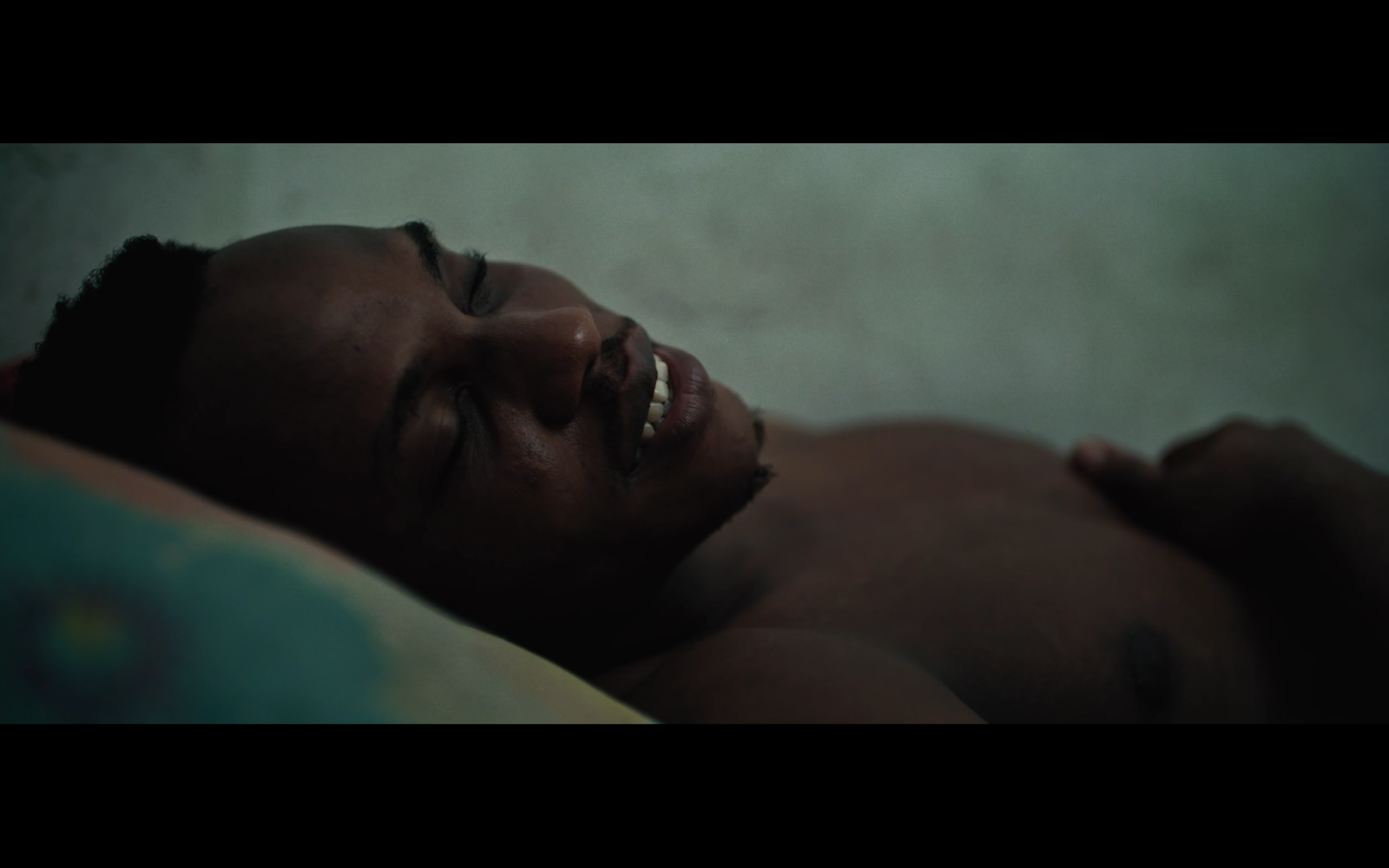
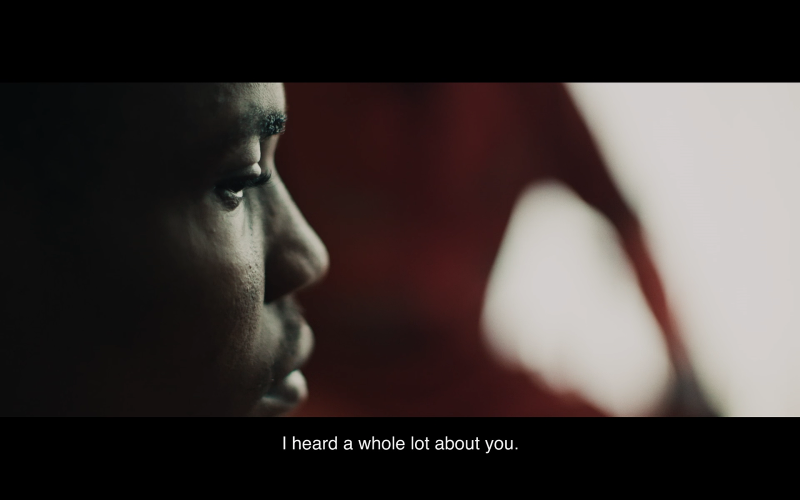
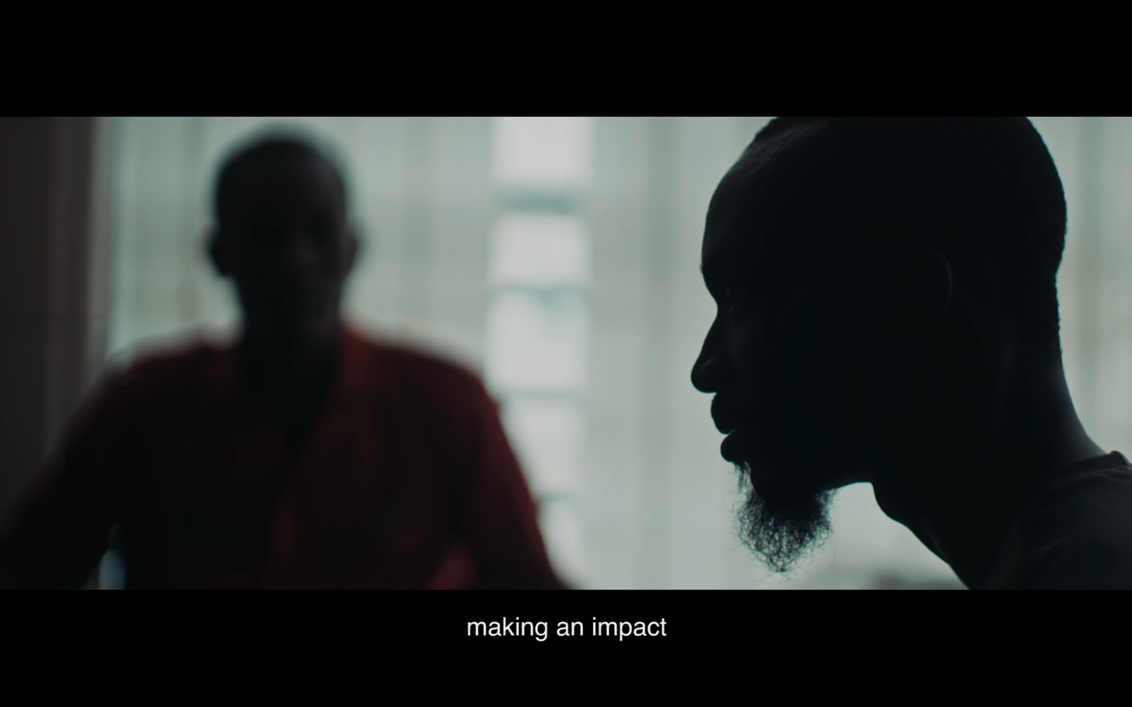
You caught Joseph in unusual places for his interview, lying on his bed for example. On another occurrence, two people speaking seem to have been placed far apart and at 90° to provide silhouettes and blurs, regardless of spatial coherence. This seems highly unrealistic yet totally convincing.
Of course, it reflects the director’s choices, but how did you collaborate to seem so symbiotic ?
(Jon Kasbe the Director seems to also have a very strong eye)
Jon is an incredible director, and a really fantastic cinematographer as well. We shoot two cameras, he operates one and I operate one.
At this point, we’ve shot thousands of hours together, and can communicate with simple eye gestures. We understand each other’s movements, and typically can stay out of each other’s shots while still getting very intimate images. It’s an amazing feeling when I have an idea to shift angles, and realize that Jon has already found the shot I was about to take. We are very in sync on a visual level.
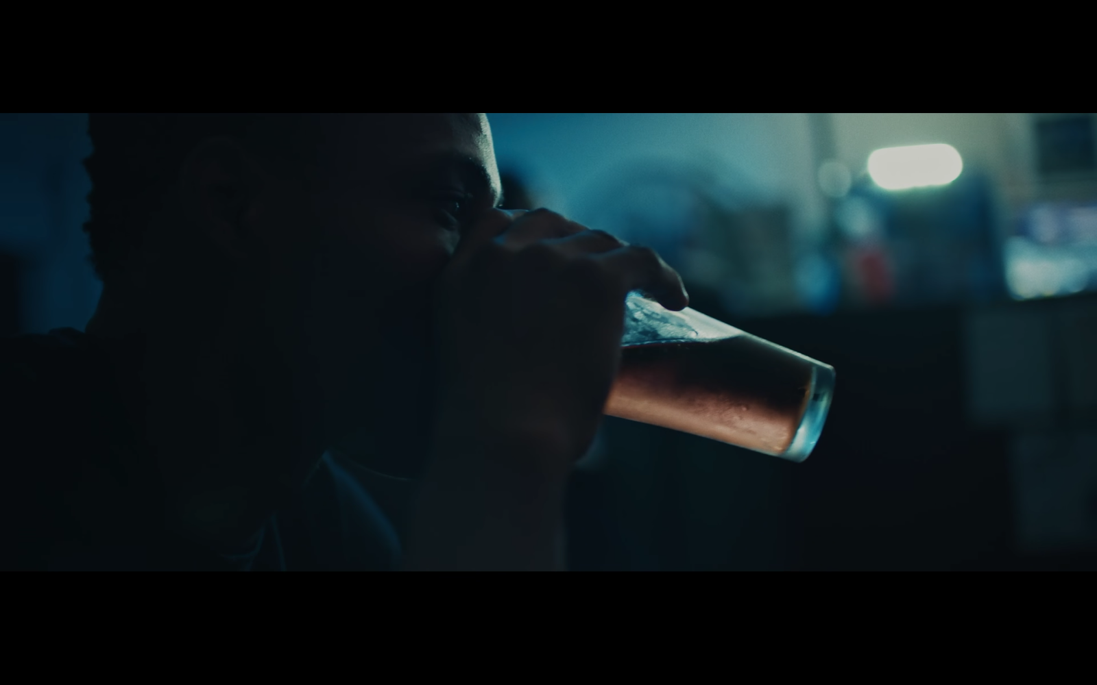
This scene was simple in a way – we turned off all the lights, and used the windows behind them as a key light – when shooting profiles, this put them in silhouette, and when shooting frontals, this gave them fantastic half-light.
This is a dramatic scene, as the characters discuss the stakes of the job, and the lives that are at risk. It seemed suitable to play them in darkness as they reflect on this idea.
A double question: how far are you aware of what’s possible in color grading (reframing included), and in what way does this knowledge affect your shooting habits ?
Color grading is always very important to me as a cinematographer, and I typically expose images to give us the most room to play around once we get into the grade.What is your favorite shot and why ?
Here’s my favorite shot :
What camera / lenses and lighting package did you use ?
Camera: Sony FS7 w/ Canon L-Series Lenses (35mm, 50mm, 24-105mm)Lighting: Battery-Powered Quasar Kit (2ft, 1ft, 6inch)
A more general question : could you show us a picture that you’ve displayed prominently in your home, that resonates a lot with you, even in mysterious ways ? And comment on it, if you feel inclined to.
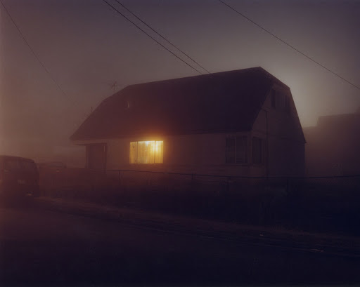
I’m a huge fan of Todd Hido, especially his House Hunting photo series. I keep all his books on my coffee table, and they constantly serve as a point of inspiration and reference.
This image in particular has always spoken to me. The dim color, the fog, and the glowing light from the interior of the house are all quite meaningful.
There’s so much mystery to the image – I often find myself wondering what’s happening inside. Some days I feel like it’s something joyful, while other days I feel there’s something tragic inside.
To me, a beautiful image can mean many things depending on the day that you look at it.