This article summarizes the notion of the psychological resonance of color, and the concept of color chords, as described in Goethe’s theory of colors.
Whether it is used to draw attention to an element of the image (an actor, a piece of the set), to separate layers of depth through color contrast, or to give a sequence its emotional tone, color is an essential component of a cinematographer’s work. Choosing it is among the most important decisions, whether in prep, on set, or in the grading suite. This text offers a basis for guiding that choice, drawn from the theory that links colors and emotions. Johann Wolfgang Goethe set out this theory in his Theory of Colors (1810).
Referring to this text in the context of cinematography is nothing new. Vittorio Storaro, AIC, ASC, undeniably one of the greatest thinkers of the cinematic image, was the first cinematographer to theorize color in film in depth. His personal theory (beautifully set out in his book I Colori) is directly inspired by Goethe’s 1. Both hold that color triggers an emotional resonance in the viewer, and that this resonance is universal and definable.
“We write stories with light and darkness, motion and color. It is a language with its own vocabulary, and endless possibilities for expressing our deepest thoughts and feelings.” – Vittorio Storaro
Goethe’s book actually consists of two parts, divided into six chapters. Chapters one through five of the first part put forward a theory of the scientific origin of color 2. In this article, we will focus instead on the sixth chapter, titled Sensory-Moral Effect of Color. It is the one that interests us most when it comes to the artistic (and therefore emotional) use of color.
Speaking of color, Goethe opens the chapter with these words: “When alone, it produces a specific effect, and in combination an effect that is partly harmonious, partly characteristic, often also inharmonious, but always decided and significant; this effect is directly connected to our moral nature. This is why color, considered as an element of art, can be used to contribute to the highest aesthetic ends”3.
Goethe defines two color “zones”: the “plus zone” and the “minus zone.”
The first includes yellow, red, and purple (what we now call magenta), colors that incline us toward feelings of “animation, liveliness, and striving” 4.
The minus zone consists of green, blue, and violet, and inclines us toward feelings of “unease, gentleness, and longing” 5.
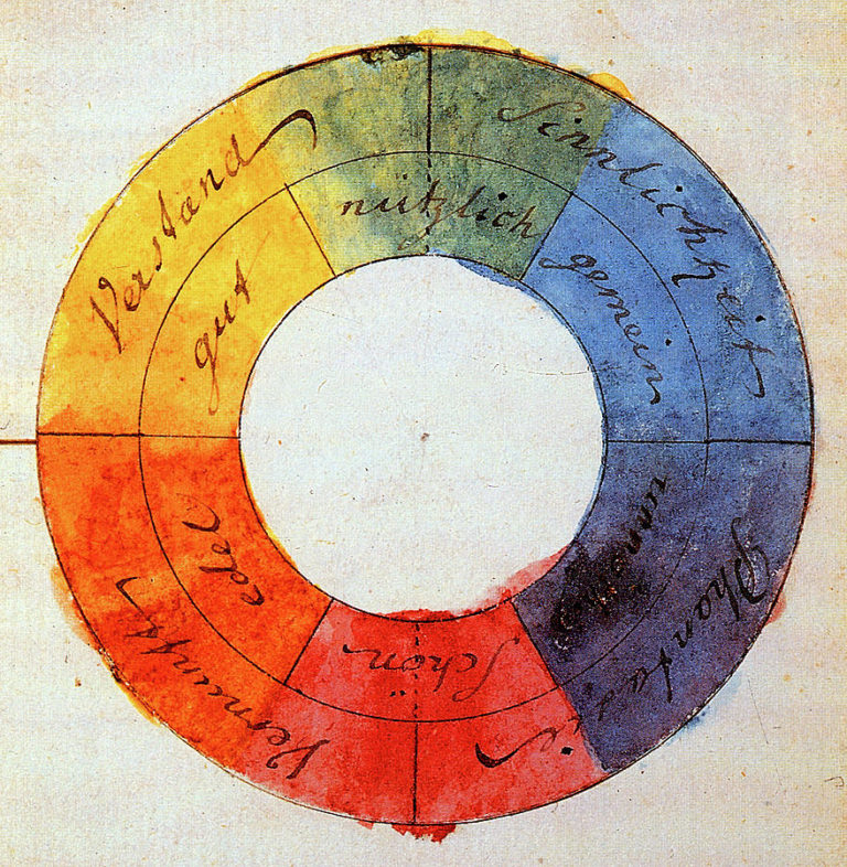
To better represent the emotional and visual oppositions between these zones, Goethe devised a “color wheel” based on six main colors: yellow, orange, and red (for the plus zone), and green, blue, and violet (for the minus zone). They differ from the colors of additive synthesis, the technical basis of color in our field.
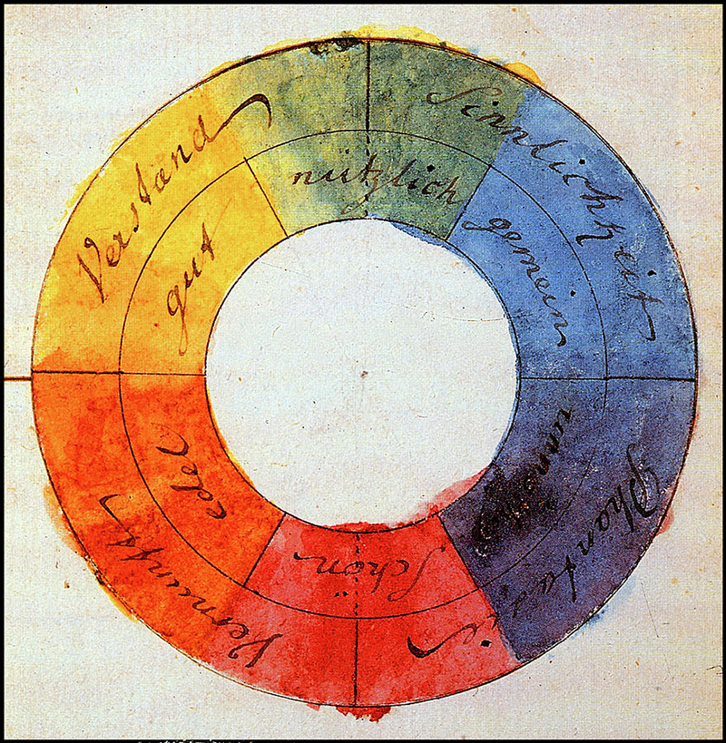
Goethe’s color wheel.
Goethe gives the name “need for totality” to the principle that governs the arrangement of colors on this wheel. He suggests that the human eye, when confronted with the emotional tone of a color, naturally craves the color that produces the opposite tone, so as to create a “totality that satisfies it”6.
For these arrangements of colors, which Goethe calls “combinations,” I will use the term “color chord” instead, which I find better suited to our practice.
Yellow, for instance, the “luminous” color par excellence, gives an impression of stimulation, warmth, and well-being. It naturally stands opposite violet, the color of shadow, which inspires melancholy, distance, and cold. The chord of these two colors therefore fulfills our natural need for totality, striking a harmonious balance by expressing an emotion and its opposite. In a way, one could say that one color “balances” the other. This is why Goethe calls combinations of colors that sit opposite each other on the wheel “harmonious combinations.”
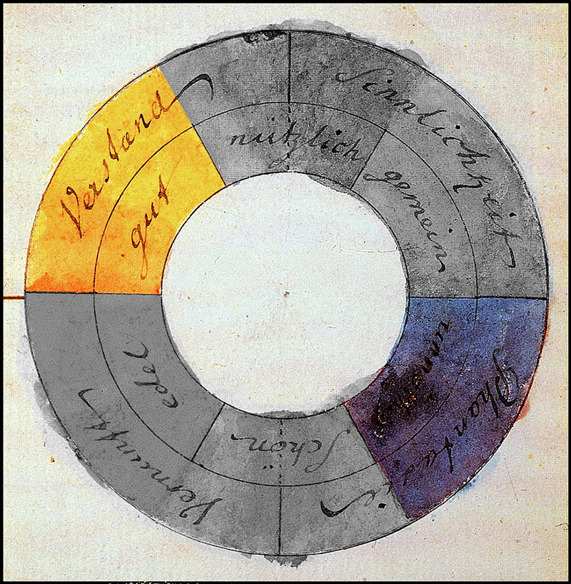
Example of a harmonious combination: yellow stands opposite violet, and together they fulfill our need for harmony.
Next come the chords Goethe calls “characteristic,” meaning that they produce an expressive force that is not entirely satisfying, since it does not tend toward harmony. On the other hand, because of its “imperfection,” a “characteristic” chord produces an emotional tone that results from the combination of its two component colors. For example, the chord of yellow and magenta has “something incomplete about it, but also something cheerful and splendid”7. These combinations are formed by skipping one color on the wheel.
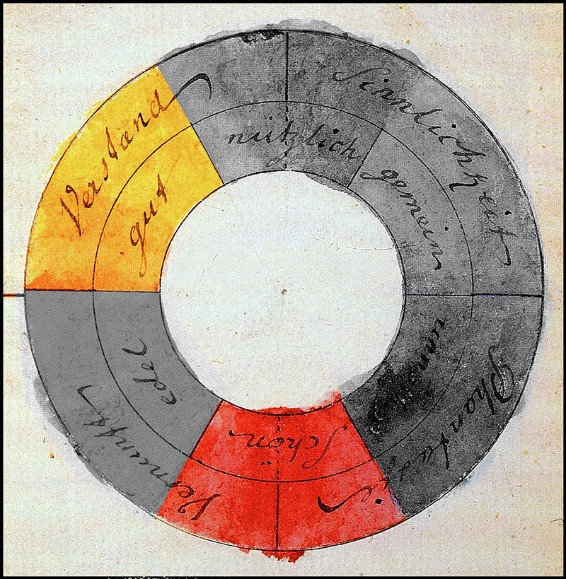
Example of a characteristic combination: yellow combines with magenta to create a tone that blends their two characters.
Finally, the third type of chord is the “characterless combination,” that is, the chord of two neighboring colors. These chords have little effect, since the two colors are too similar to make a striking impression. Rather than a precise impression, they mark a progression, or an evolution in a feeling. The chord of yellow and red, for example, can mark a progression from energy toward passion.
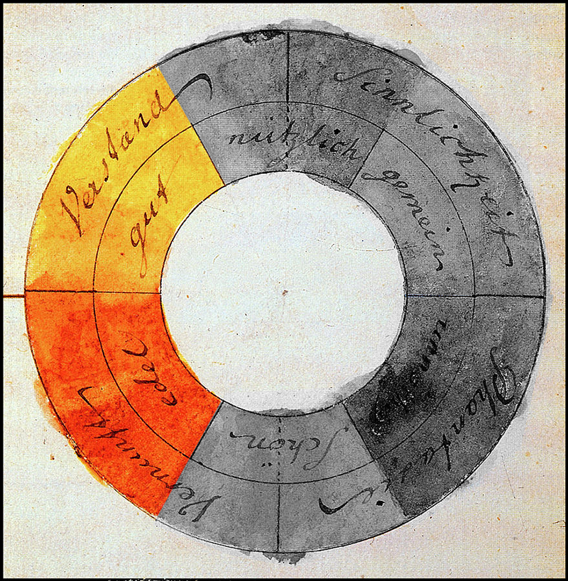
Example of a characterless combination: yellow and red together produce a “gradient” rather than an emotional expression.
Goethe’s theory, of course, goes much further into the psychological values of each color and of color chords. He also suggests a way to strengthen the expression of these chords by playing on what we cinematographers call the luminance of a color, for instance by varying a chord with a light “plus zone” color and a dark “minus zone” color. The aim of this article is not to transcribe every detail of this rich and complex theory, but simply to explain its basics and offer them as a source of inspiration when composing an image.
Nor is the point to argue that this color theory is the only valid one, or even the most essential. No such definitive, closed claim is made here. Goethe’s theory is simply presented as one possible compass amid the vast range of options open to cinematographers when they face choices about color.
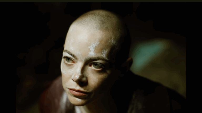
To finish, here are a few examples of color chords from the series Euphoria, which in my view is an excellent demonstration of them. I leave it to readers to identify the types of combinations used, and the emotional tone they evoke.
Euphoria, 2019, shot by Marcell Rév, Drew Daniels, Adam Newport-Berra, and André Chemetoff.
1 – https://britishcinematographer.co.uk/vittorio-storaro-aic-asc-wonder-wheel/
2– https://en.wikipedia.org/wiki/Theory_of_Colours
3– Johann Wolfgang Goethe, Traité des couleurs (French edition), Éditions Triades.
4,5,6,7– Ibid.